
Amplifin
Amplifin helps businesses unlock the power of payments. A modern fintech brand that simplifies collections and drives financial inclusion through smart, secure solutions.
Problem
With their early-stage branding no longer fit for market, Amplifin needed a sharper, more professional identity to reflect their maturity and credibility in South Africa’s national payment system.
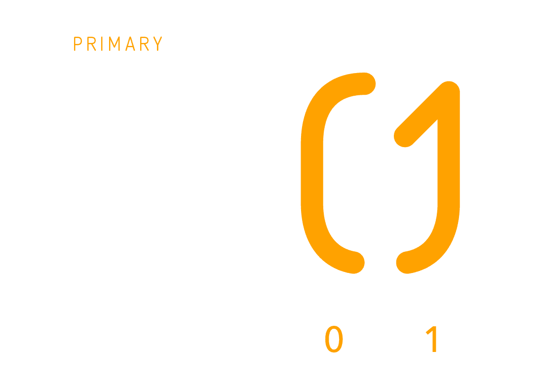
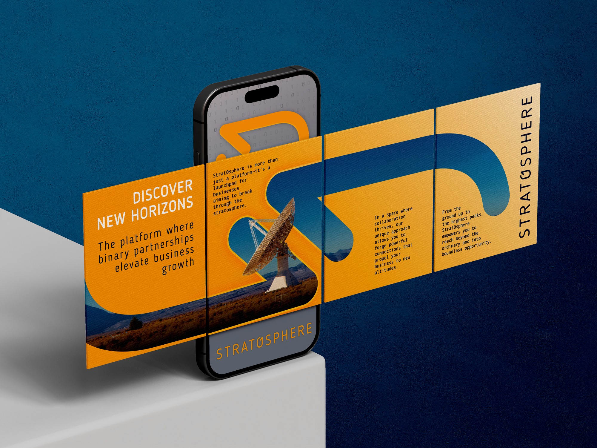
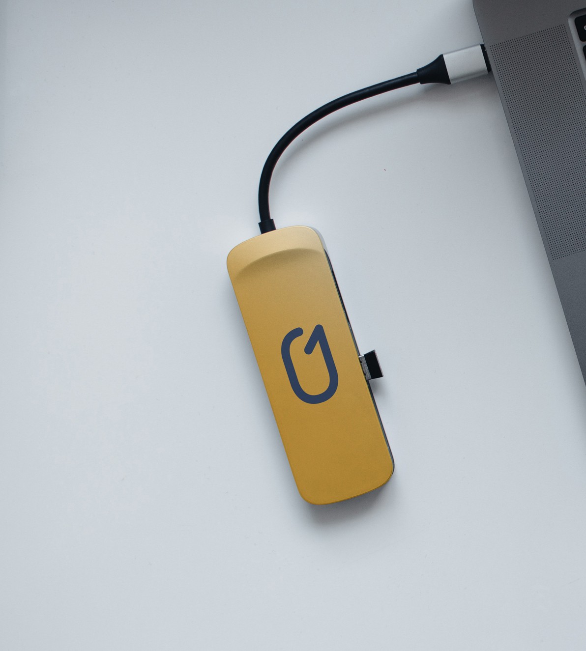
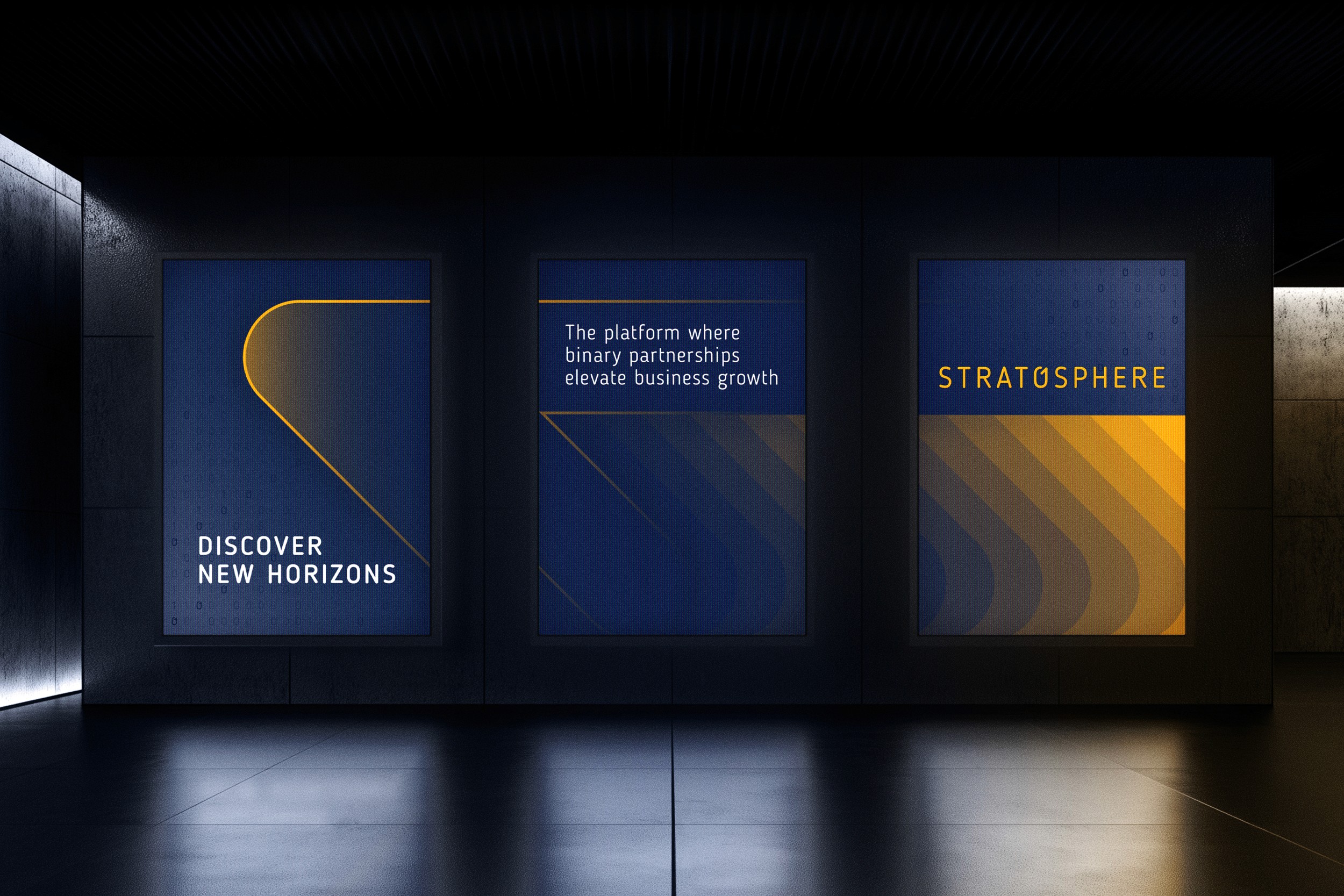
We created a sleek, modular identity that balances fintech precision with human warmth. The wordmark is framed by an implied bracket and paired with a superscript plus symbol, a subtle visual metaphor for amplifying client potential. Lowercase typography keeps the brand modern and approachable, while bold blues and a vibrant golden yellow create strong visual recognition.
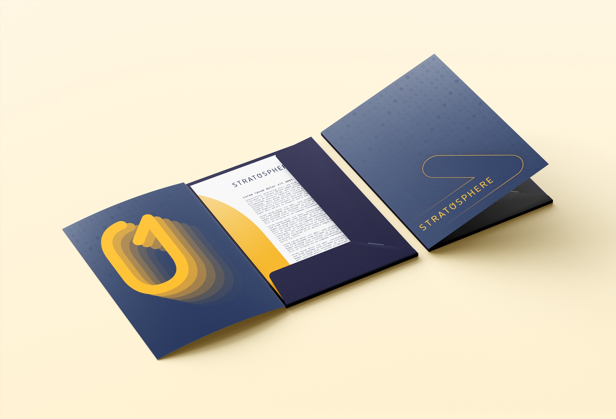
To expand the identity, we created a flexible visual language using scalable brackets and plus signs. These elements serve as graphic devices, patterns, and framing tools, enhancing the brand through consistency and adaptability. This system brings structure and energy to everything from billboards to onboarding screens, reinforcing Amplifin’s role as both a dependable infrastructure provider and a catalyst for client growth.
Roles
Creative Direction - Shannon Davis
Design - Reinhard Greyling


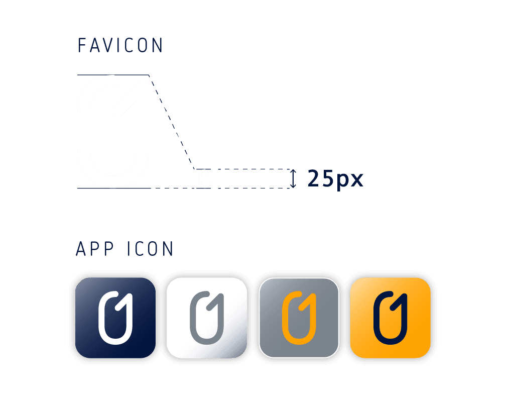
Logo Methodology

Logo Usage
Colour


Typography & UI
Logo supergraphic

Pattern


More Works

Amplifin
Amplifin helps businesses unlock the power of payments. A modern fintech brand that simplifies collections and drives financial inclusion through smart, secure solutions.
Problem
With their early-stage branding no longer fit for market, Amplifin needed a sharper, more professional identity to reflect their maturity and credibility in South Africa’s national payment system.
We created a sleek, modular identity that balances fintech precision with human warmth. The wordmark is framed by an implied bracket and paired with a superscript plus symbol, a subtle visual metaphor for amplifying client potential. Lowercase typography keeps the brand modern and approachable, while bold blues and a vibrant golden yellow create strong visual recognition.
To expand the identity, we created a flexible visual language using scalable brackets and plus signs. These elements serve as graphic devices, patterns, and framing tools, enhancing the brand through consistency and adaptability. This system brings structure and energy to everything from billboards to onboarding screens, reinforcing Amplifin’s role as both a dependable infrastructure provider and a catalyst for client growth.
Roles
Creative Direction - Shannon Davis
Design - Reinhard Greyling
Logo Methodology
Logo Usage
Colour
Typography & UI
Logo supergraphic
Pattern
More Works