Biodx
Biodx is breaking the chemical chain. A biotech brand harnessing natural ingredients to create the world’s first environmentally friendly disinfectant, built to protect people and the planet.
Problem
After over a decade of R&D, Biodx approached us with a ready-for-market breakthrough product, but only a basic visual identity. They needed a brand that could speak to both the scientific credibility and natural ethos behind their mission.
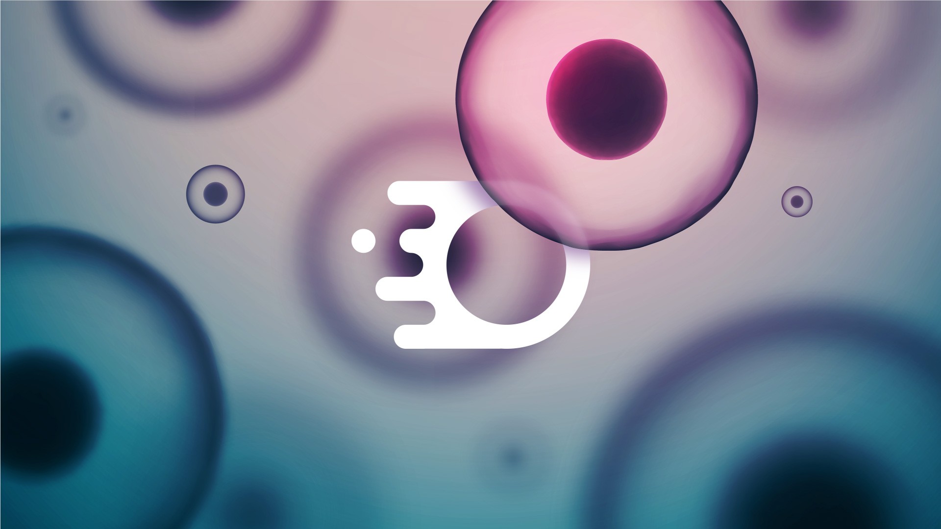
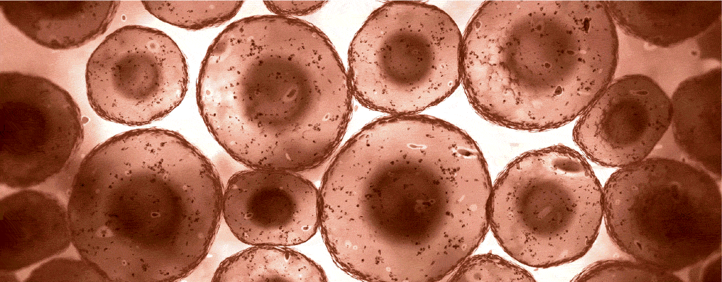
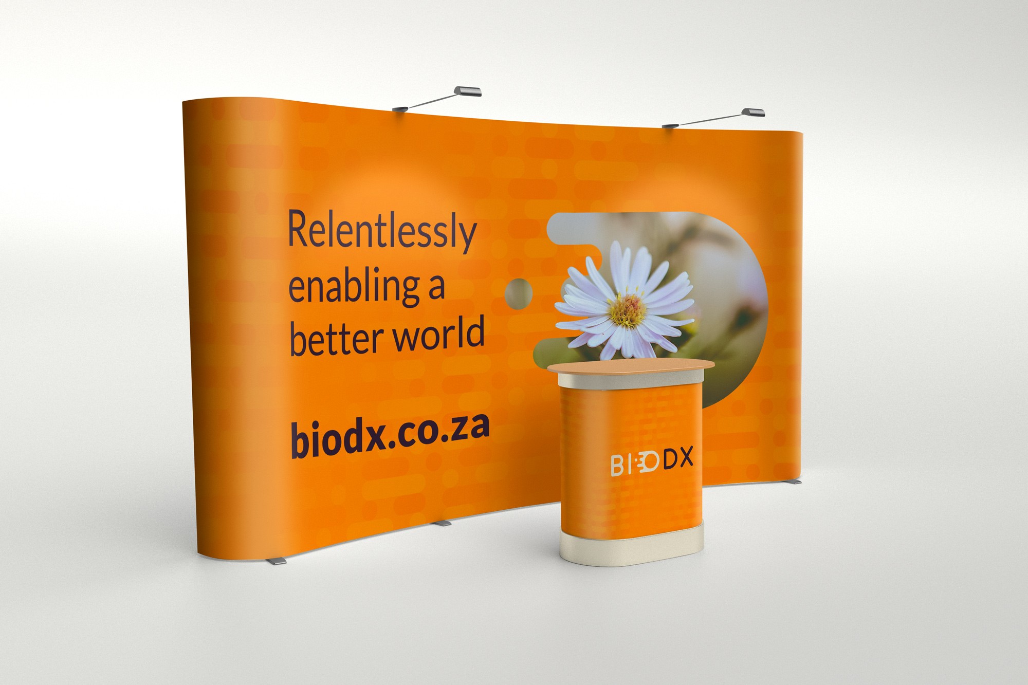
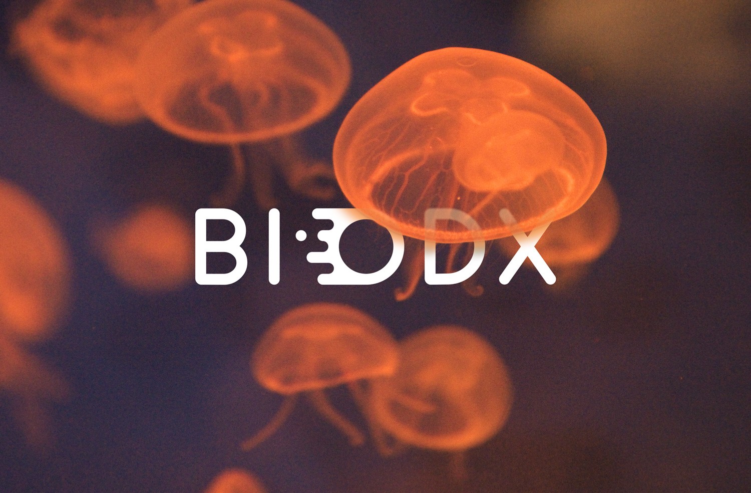
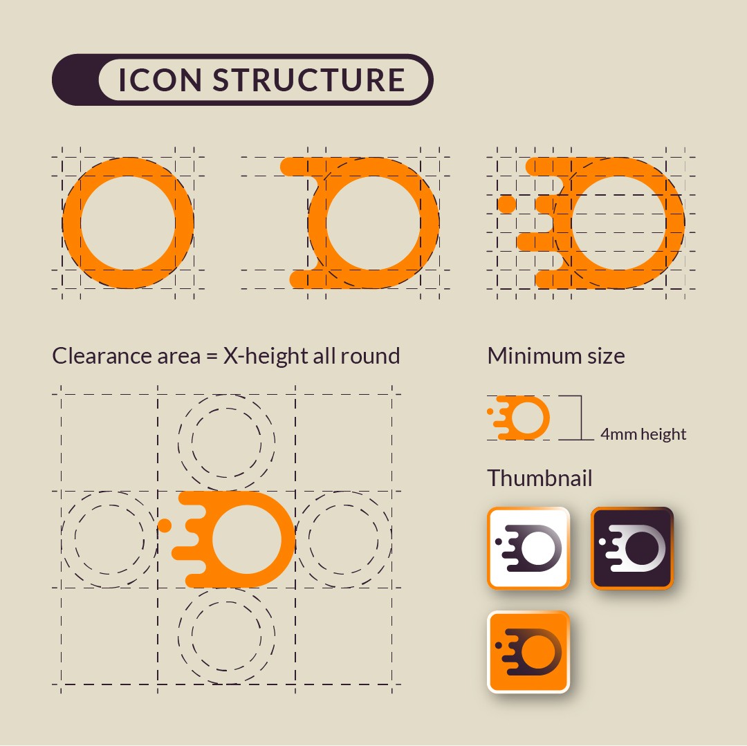
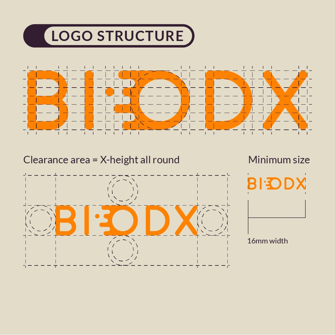
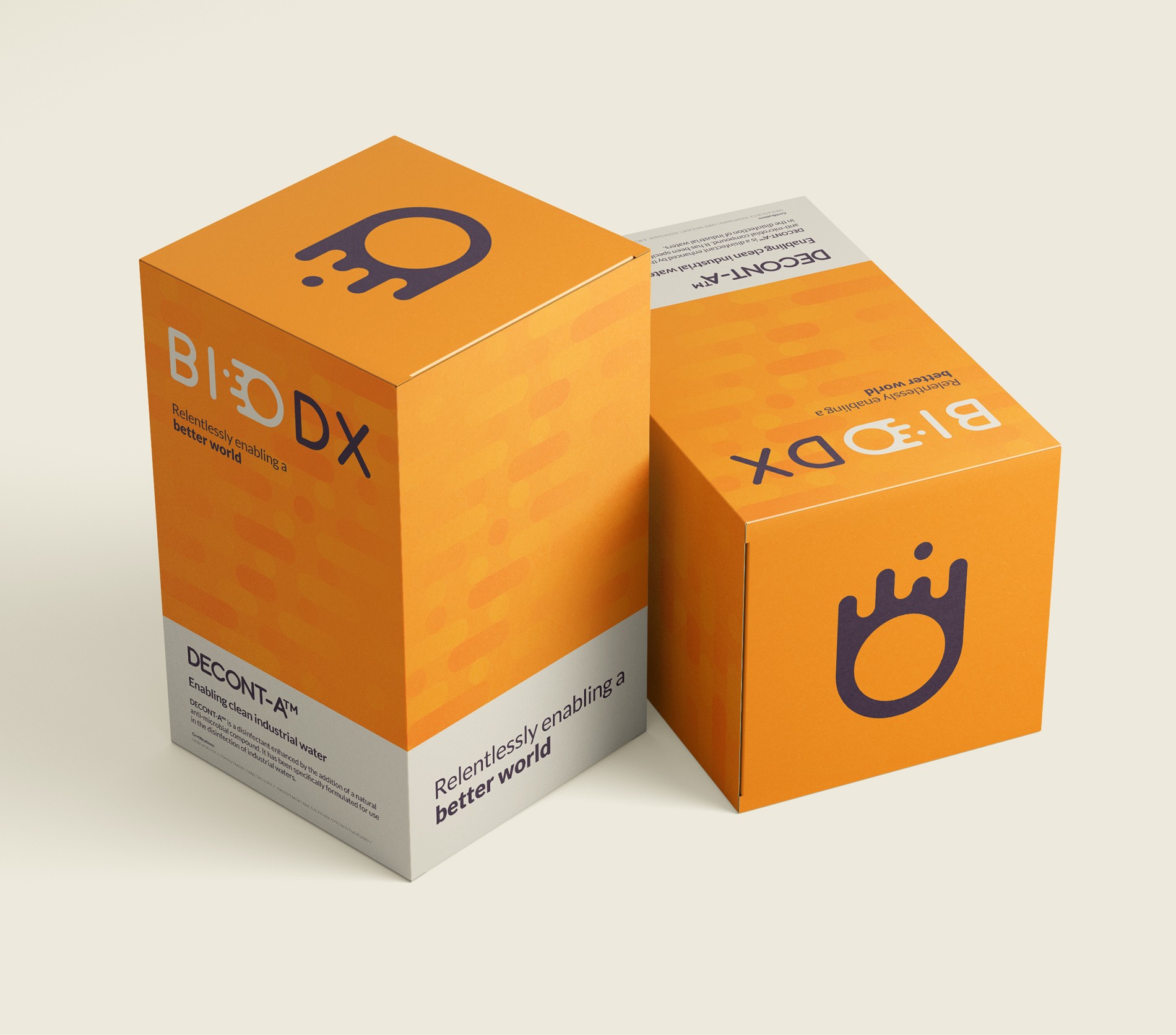
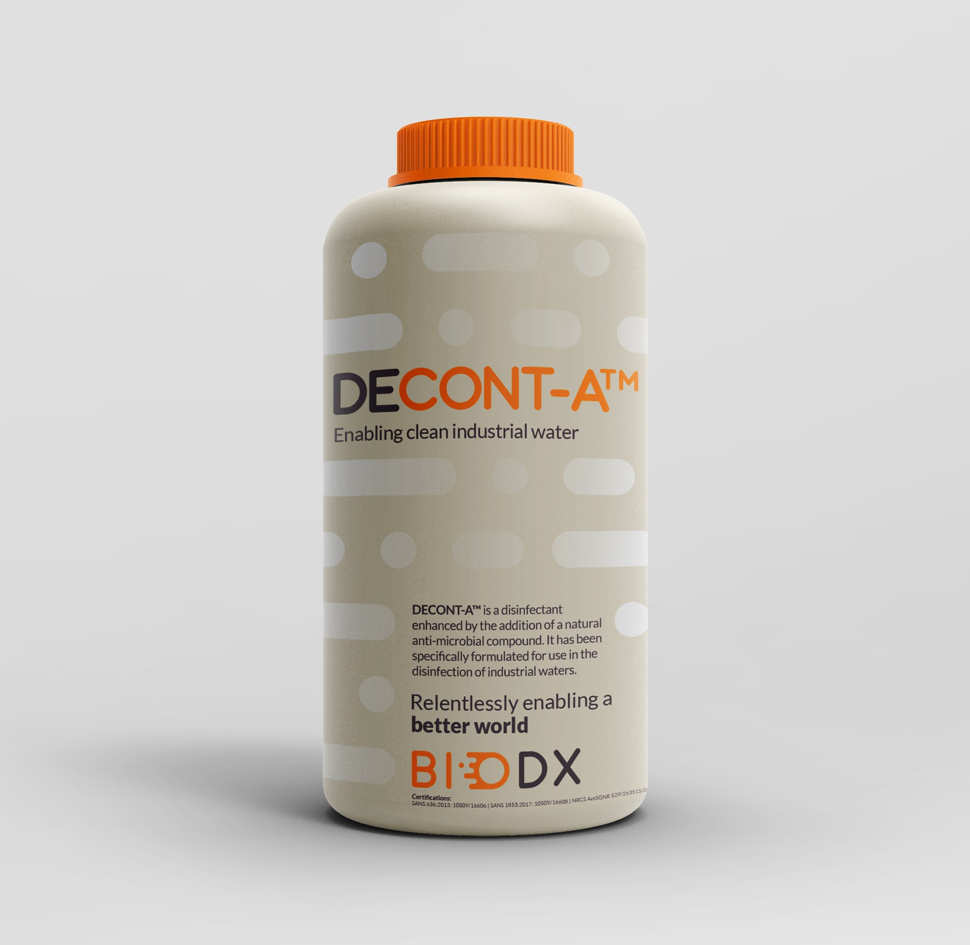
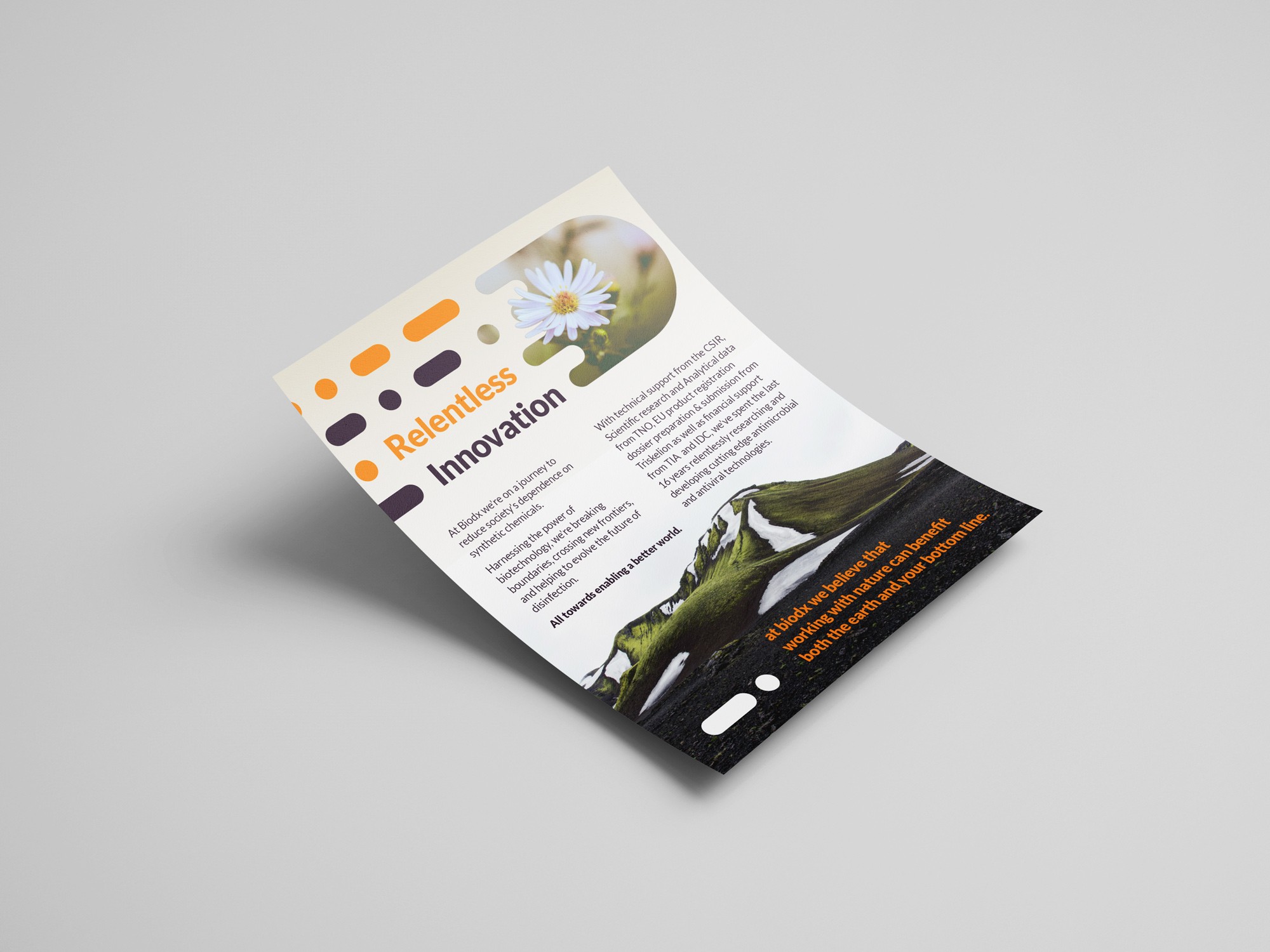
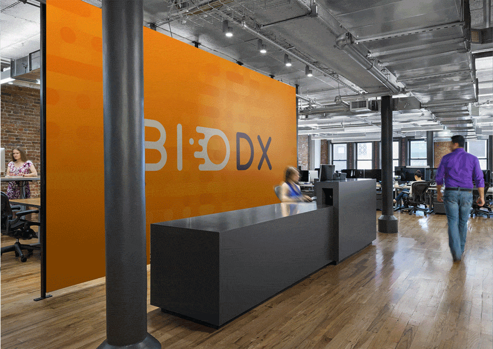
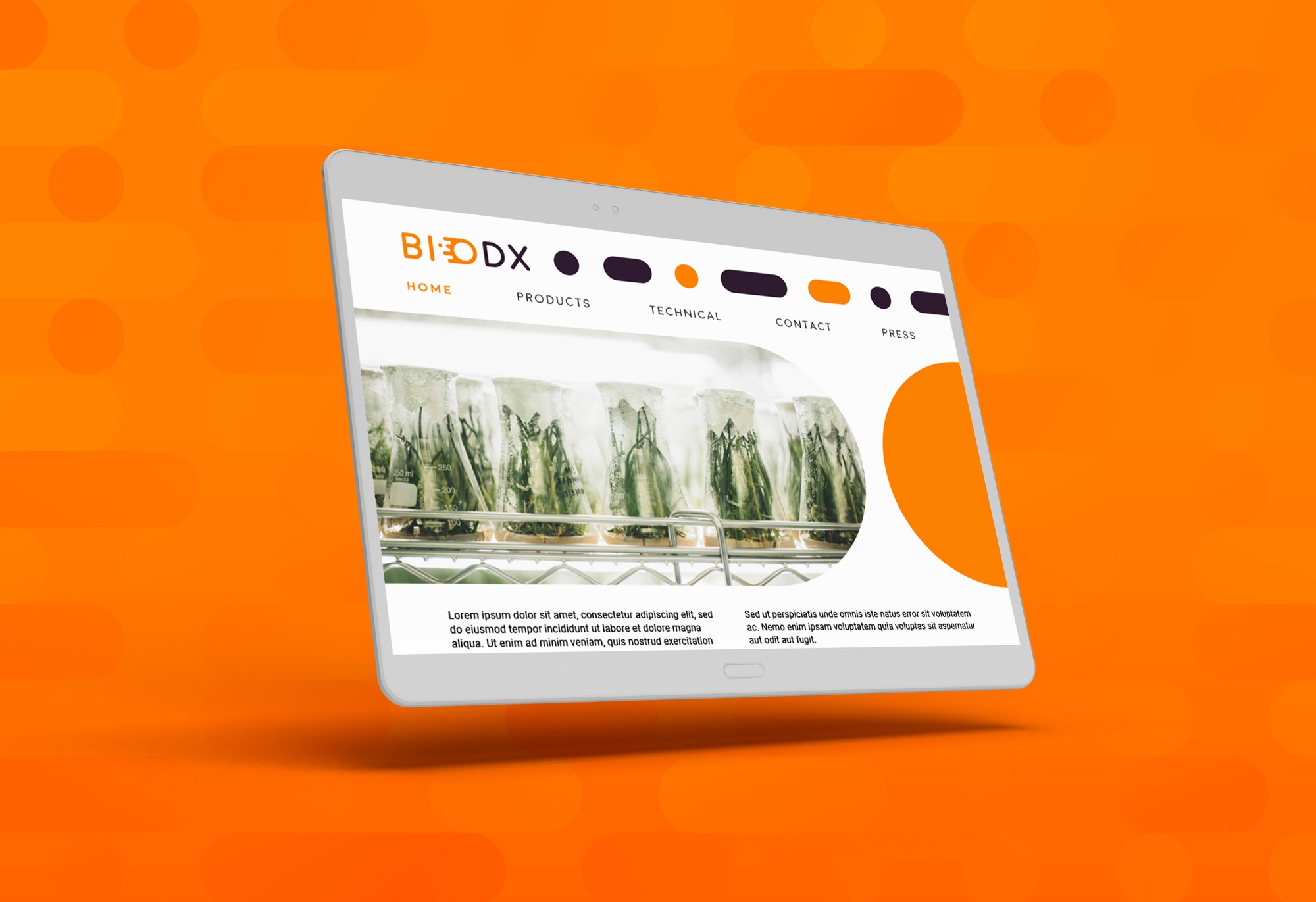
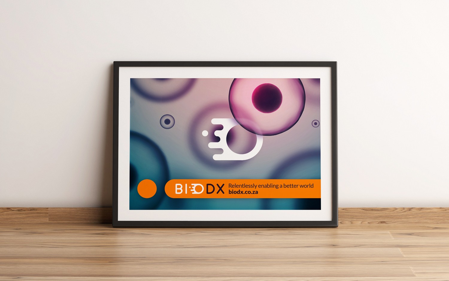
We created a soft, organic identity that reflects Biodx’s commitment to working with nature, not against it. The logo combines a custom wordmark with a distinct cellular-inspired pictogram, designed to represent the brand’s origin at a microscopic level. This symbol also forms the basis of a flexible pattern system, appearing across print, digital and packaging to unify the brand experience.
Rounded shapes, gentle geometry and a palette anchored by rich purple and energetic orange help strike a balance between clinical precision and human warmth. The result is a confident, accessible brand, one that feels credible in the lab and approachable on the shelf.
Roles
Creative Direction - Shannon Davis
Design - Reinhard Greyling


LOGO METHODOLOGY
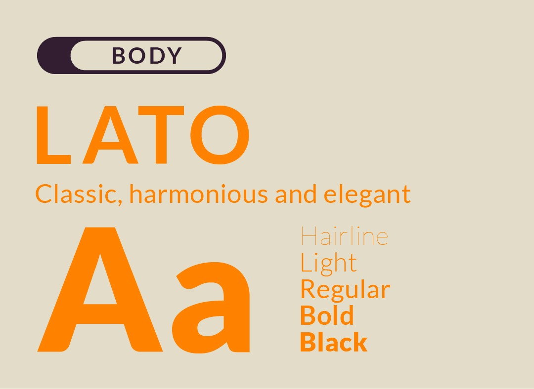
TYPOGRAPHY

COLOUR


PRODUCT PACKAGING


More Works

Biodx
Biodx is breaking the chemical chain. A biotech brand harnessing natural ingredients to create the world’s first environmentally friendly disinfectant, built to protect people and the planet.
Problem
After over a decade of R&D, Biodx approached us with a ready-for-market breakthrough product, but only a basic visual identity. They needed a brand that could speak to both the scientific credibility and natural ethos behind their mission.
We created a soft, organic identity that reflects Biodx’s commitment to working with nature, not against it. The logo combines a custom wordmark with a distinct cellular-inspired pictogram, designed to represent the brand’s origin at a microscopic level. This symbol also forms the basis of a flexible pattern system, appearing across print, digital and packaging to unify the brand experience.
Rounded shapes, gentle geometry and a palette anchored by rich purple and energetic orange help strike a balance between clinical precision and human warmth. The result is a confident, accessible brand, one that feels credible in the lab and approachable on the shelf.
Roles
Creative Direction - Shannon Davis
Design - Reinhard Greyling
LOGO METHODOLOGY
TYPOGRAPHY
COLOUR
PRODUCT PACKAGING
More Works