
Stratosphere
Strat0sphere was built to launch business relationships into new territory. A sleek, tech-forward networking platform designed to help companies partner, grow and reach greater heights together.
Problem
Atio approached us to brand their new B2B social platform. A digital space for companies to connect and collaborate. The identity needed to convey a sense of innovation and ambition while remaining grounded in corporate credibility.
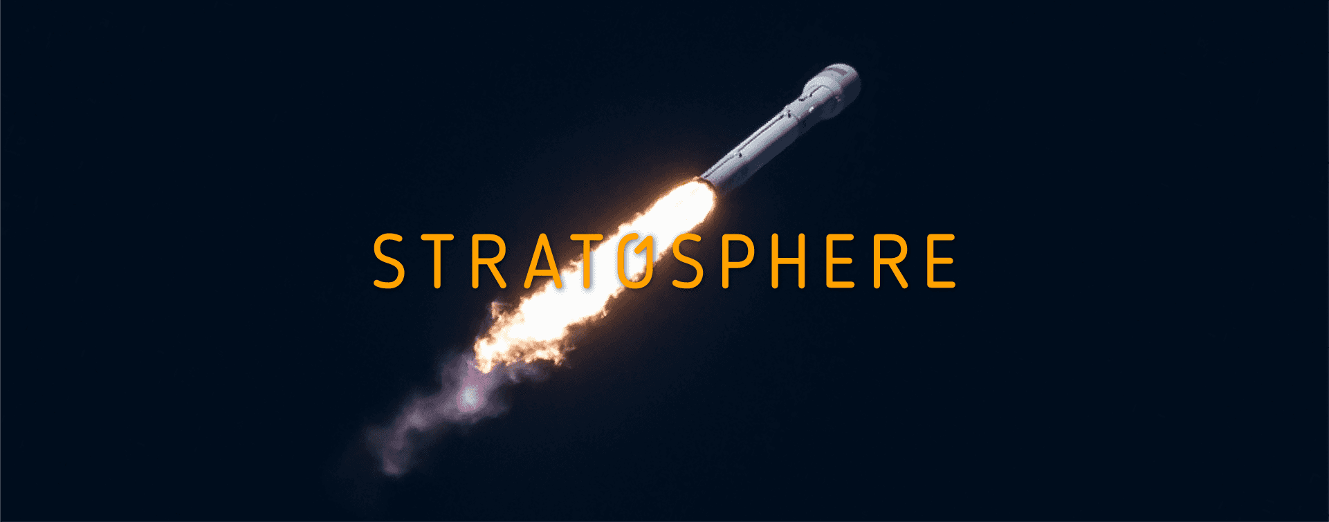
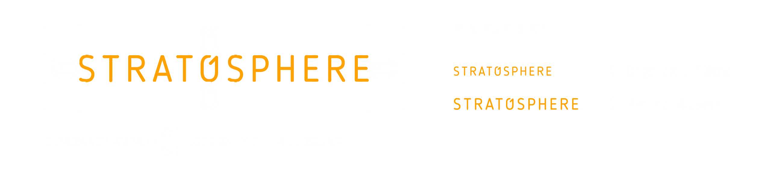
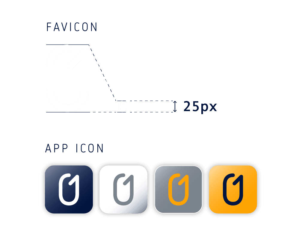
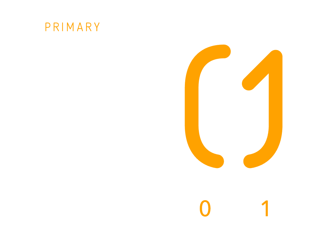
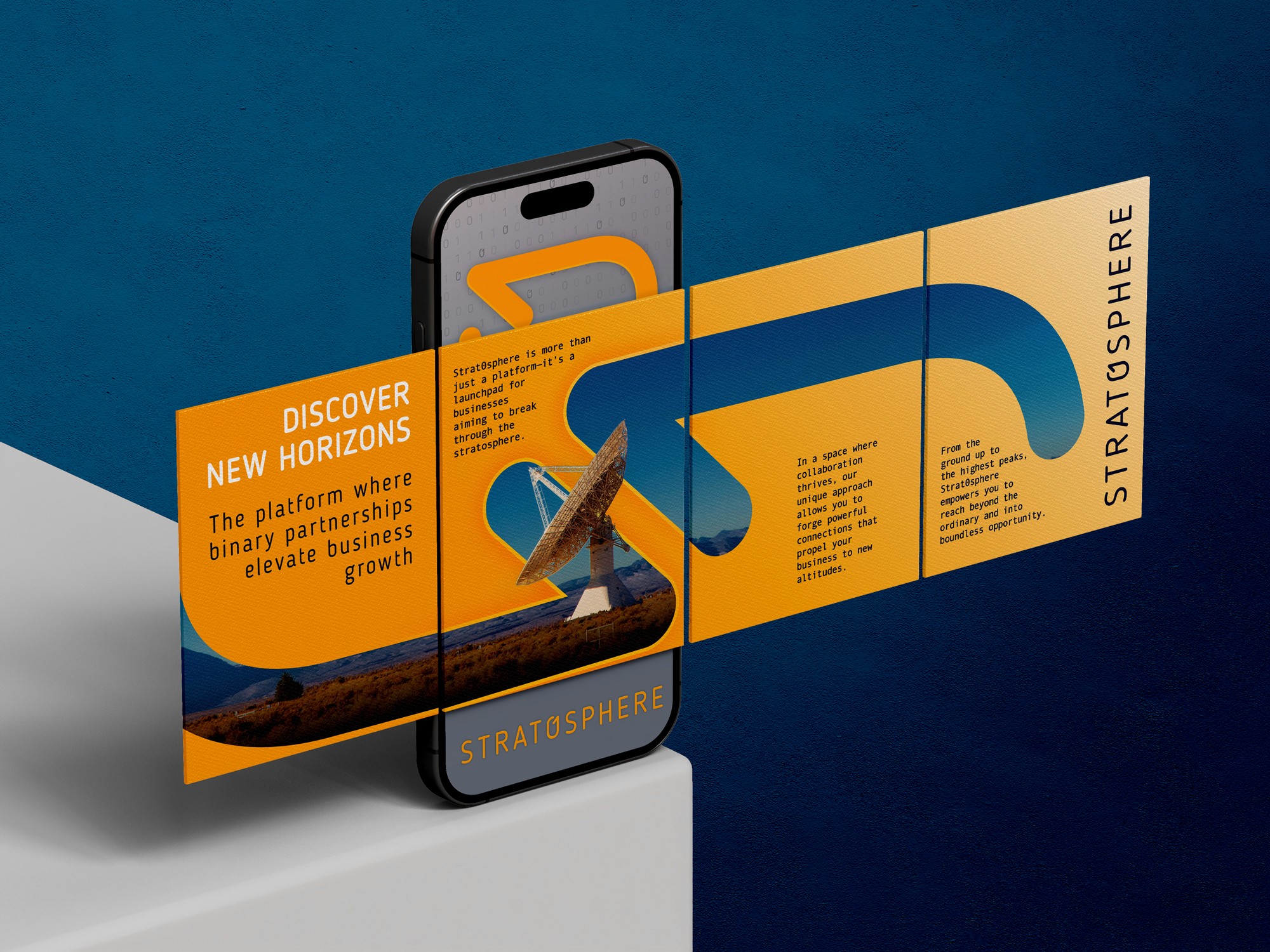
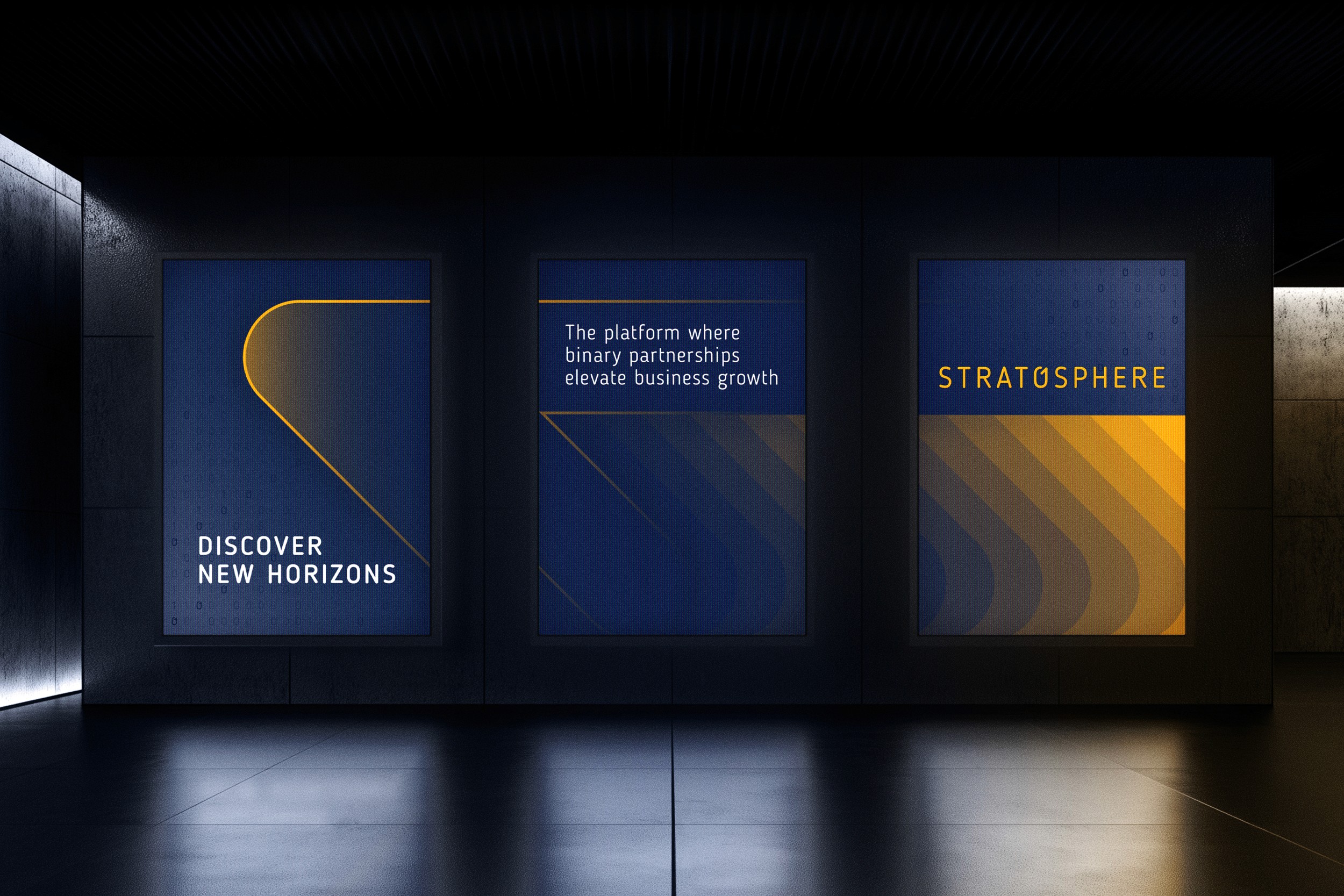
We developed a clean, modular identity inspired by the platform’s binary foundations, a system built around connection, clarity and digital fluency. The logotype features a custom “0” that nods to binary code, representing the one-to-one partnerships the platform was built to foster. A bold palette of deep navy and solar yellow conveys trust, energy and momentum, while curved forms suggest altitude and lift.
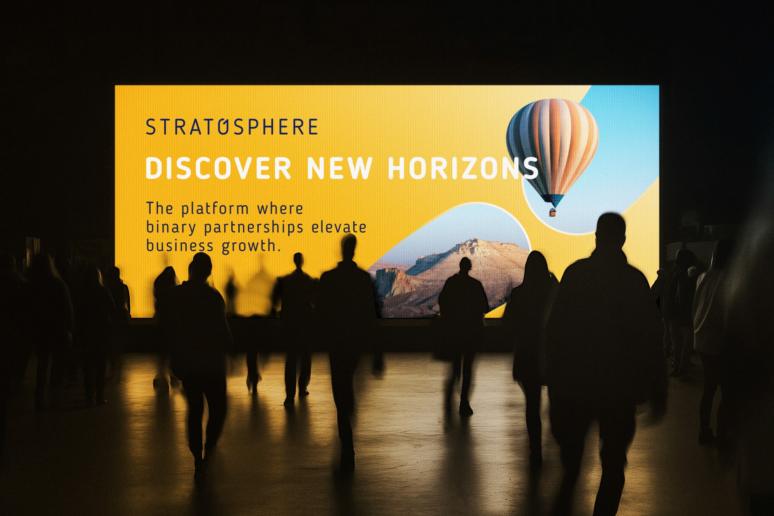
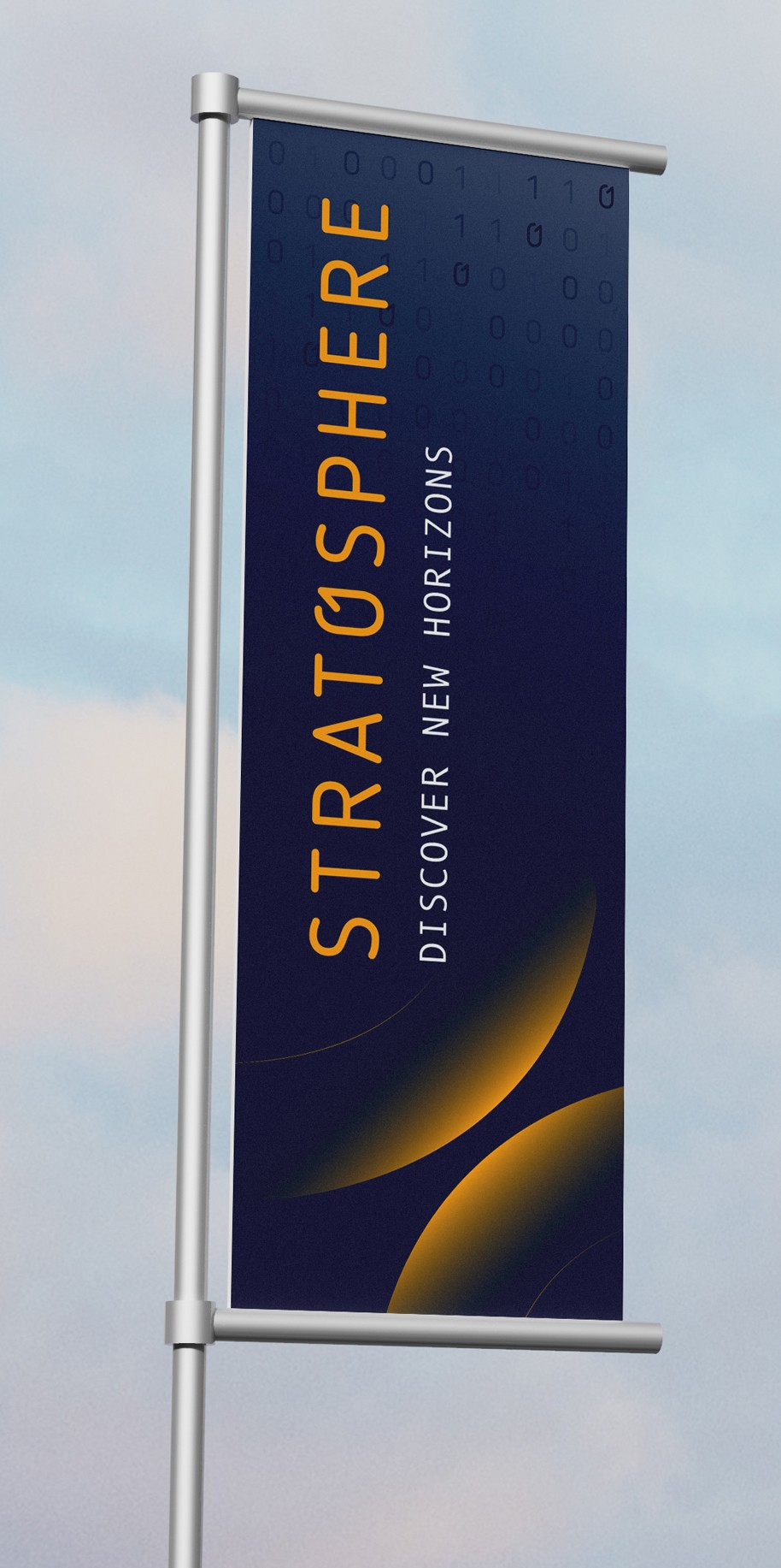
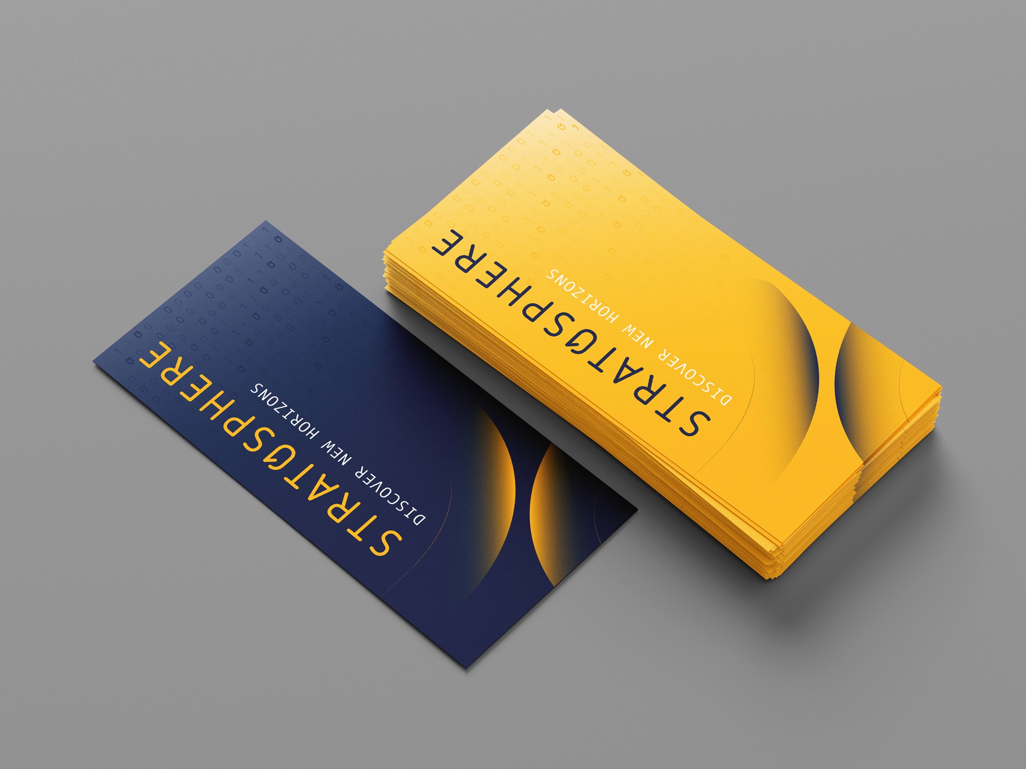
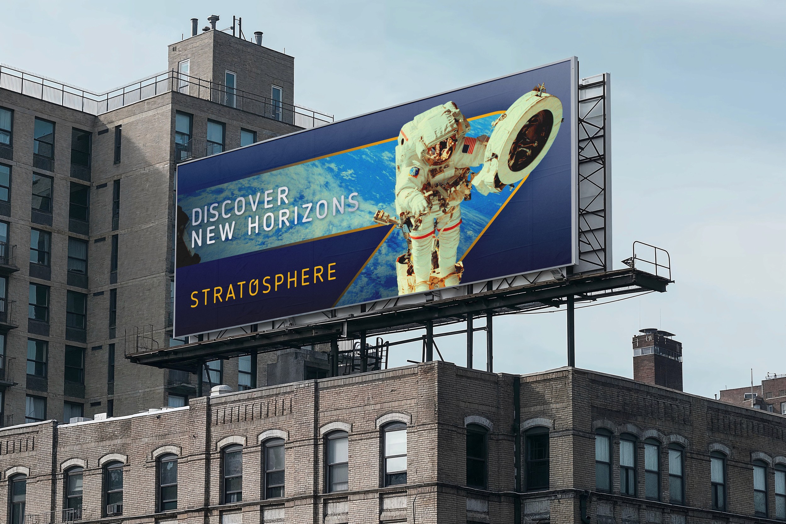
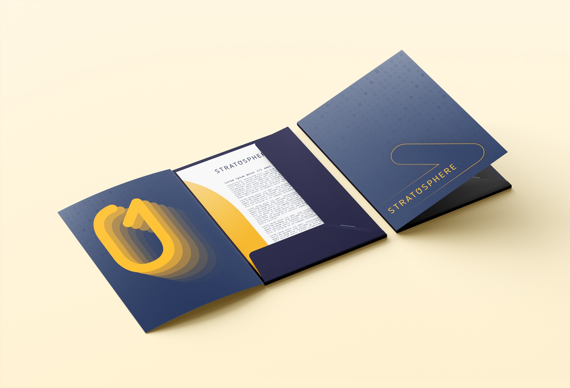
To support real-world application, we designed a system of adaptable brand elements including dynamic patterns and scalable supergraphics. These assets bring a sense of depth and movement across digital and physical environments, from app interfaces and ID cards to large-scale signage and printed collateral. This flexibility ensures the brand remains cohesive yet expressive, capable of growing with the platform as it expands its possibilities.
Roles
Creative Direction - Shannon Davis
Design - Reinhard Greyling


Logo Methodology

Logo Usage
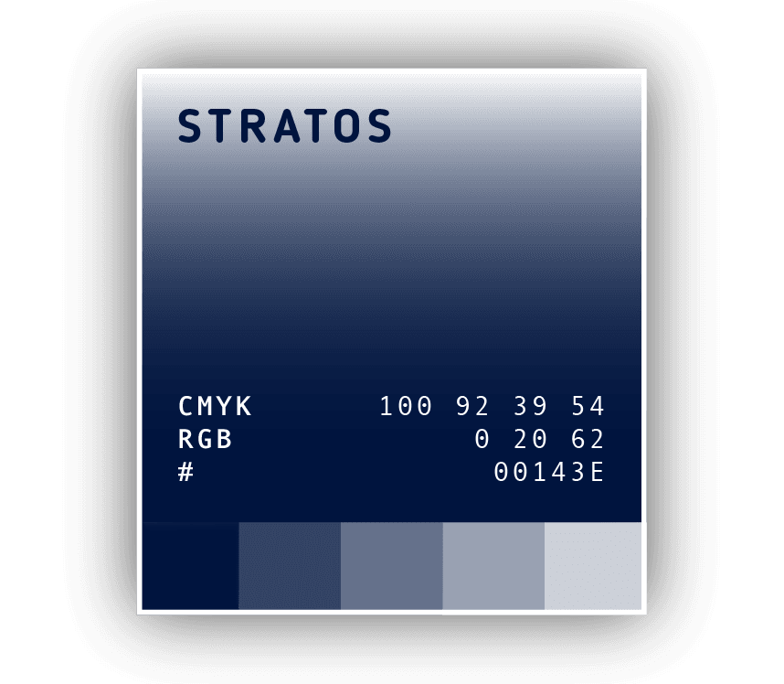
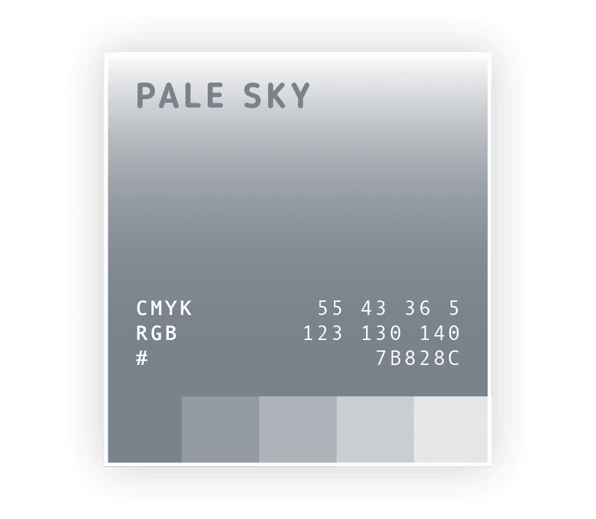
Colour

Typography & UI
Logo supergraphic

Pattern


More Works

Stratosphere
Strat0sphere was built to launch business relationships into new territory. A sleek, tech-forward networking platform designed to help companies partner, grow and reach greater heights together.
Problem
Atio approached us to brand their new B2B social platform. A digital space for companies to connect and collaborate. The identity needed to convey a sense of innovation and ambition while remaining grounded in corporate credibility.
We developed a clean, modular identity inspired by the platform’s binary foundations, a system built around connection, clarity and digital fluency. The logotype features a custom “0” that nods to binary code, representing the one-to-one partnerships the platform was built to foster. A bold palette of deep navy and solar yellow conveys trust, energy and momentum, while curved forms suggest altitude and lift.
To support real-world application, we designed a system of adaptable brand elements including dynamic patterns and scalable supergraphics. These assets bring a sense of depth and movement across digital and physical environments, from app interfaces and ID cards to large-scale signage and printed collateral. This flexibility ensures the brand remains cohesive yet expressive, capable of growing with the platform as it expands its possibilities.
Roles
Creative Direction - Shannon Davis
Design - Reinhard Greyling
Logo Methodology
Logo Usage
Colour
Typography & UI
Logo supergraphic
Pattern
More Works