
Accomplish
Accomplish was created to help payment innovators move fast and think bigger. A bold identity for a group built to support financial institutions with smarter, more flexible solutions.
Problem
As a full-spectrum payment provider, Accomplish needed a brand that felt both innovative and dependable, one that could stand out in a crowded fintech space while reinforcing its role as a supportive partner.
We built a bold, flexible identity that reflects Accomplish’s dual role: delivering advanced payment tech while supporting the growth of its clients. The logo features a greater than symbol placed before the wordmark, reinforcing the idea of always backing the client. A vivid palette of red, navy and aqua gives the brand instant visibility with a confident, professional tone.
A two-part supergraphic system, both derived from the logo, brings the identity to life across a multitude of touchpoints. One version supports clean, structured layouts; the other uses the tip of the symbol to highlight bylines and key messaging. This visual language ensures the brand remains distinctive and adaptable across print, digital and physical environments.
Roles
Creative Direction - Shakera Kaloo
Design - Reinhard Greyling

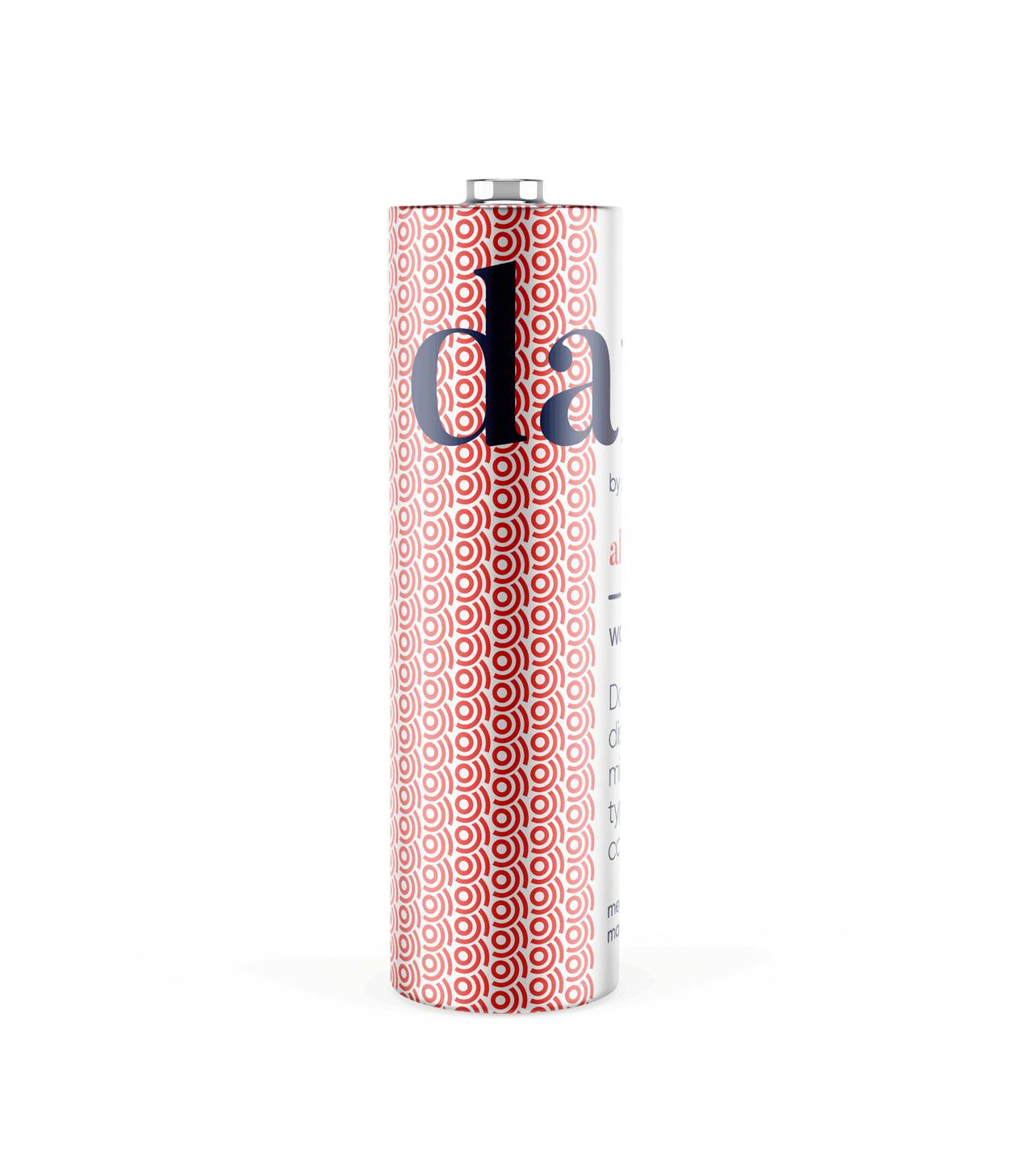
product logo

The identity used a simple, elegant and recognisable wordmark that could work across a wide variety of products and function easily as a conglomerate brand mark.
The pattern would serve to identify the product range and in some instances the pattern colour is used to distinguish mutiple products under the same range, such as flavours of fruit juice.
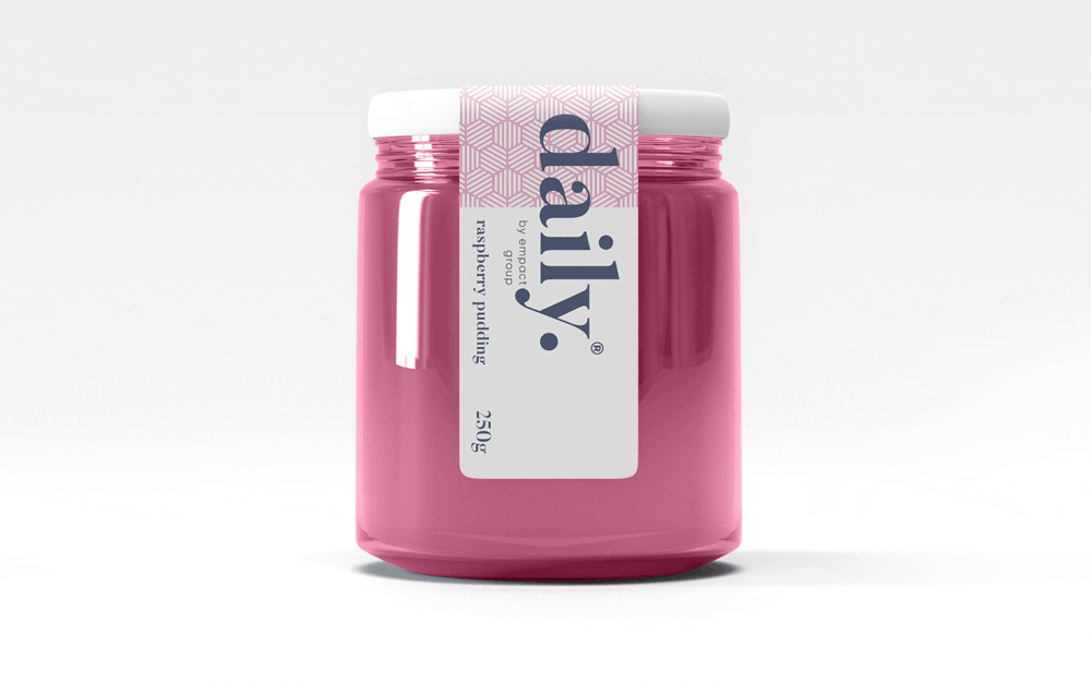
daily brand structure
The design uses generous white space to fit dense copy on small labels.
Scalable branding elements create extra room, with the product name aligned above the holding company byline at the label’s base.

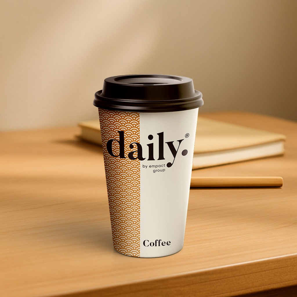
daily product pattern
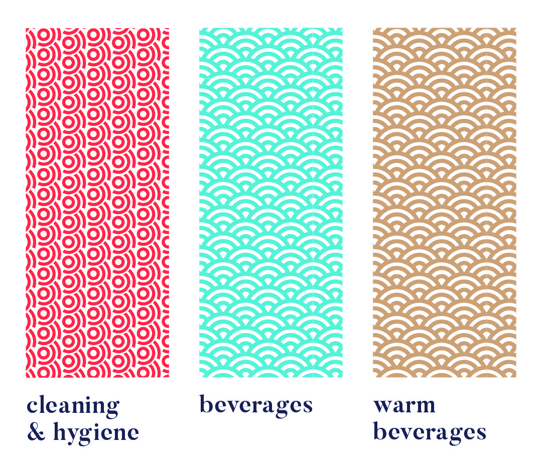
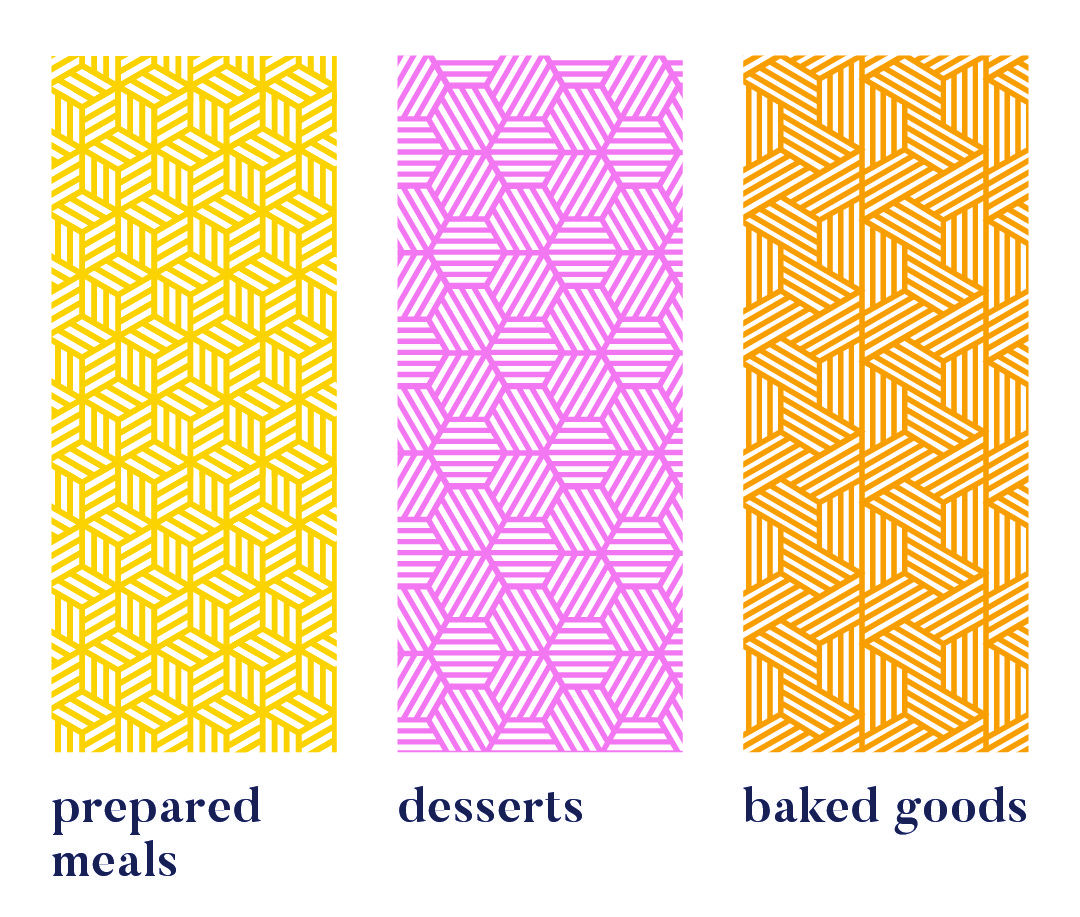
Each range uses a unique pattern for quick visual recognition.
Colour variations within a pattern distinguish sub-products, like hot vs cold drinks or juice flavours. Cleaning & Hygiene products use a red pattern from the Supercare logo, signalling both chemical use and brand affiliation.
daily product creative


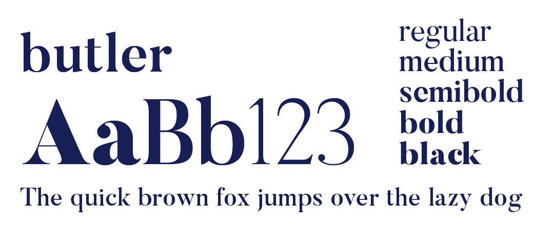
daily typography

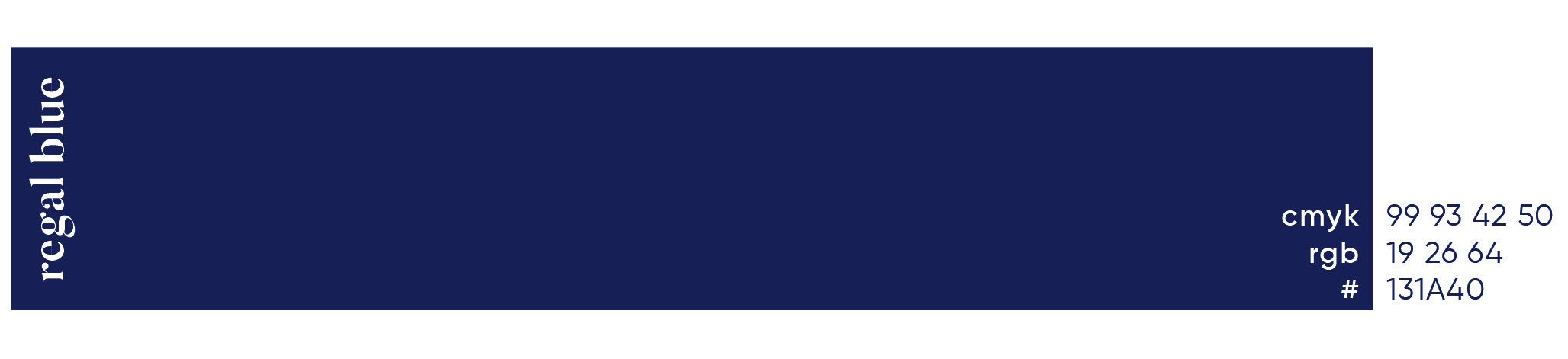
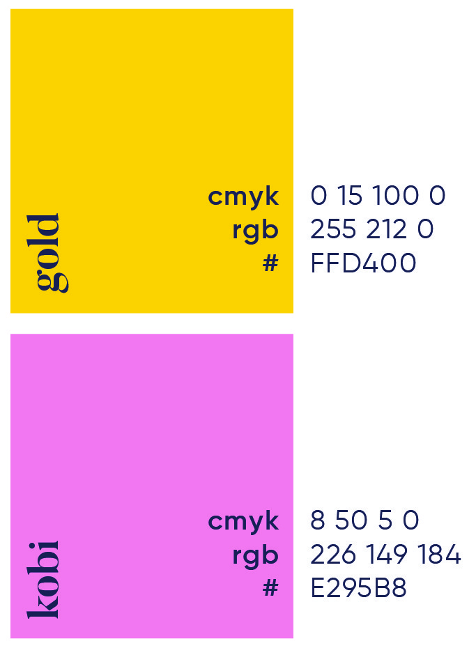
daily primary colour
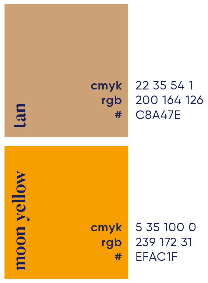
daily secondary colour palette

daily brand pattern


More Works

Accomplish
Accomplish was created to help payment innovators move fast and think bigger. A bold identity for a group built to support financial institutions with smarter, more flexible solutions.
Problem
As a full-spectrum payment provider, Accomplish needed a brand that felt both innovative and dependable, one that could stand out in a crowded fintech space while reinforcing its role as a supportive partner.
We built a bold, flexible identity that reflects Accomplish’s dual role: delivering advanced payment tech while supporting the growth of its clients. The logo features a greater than symbol placed before the wordmark, reinforcing the idea of always backing the client. A vivid palette of red, navy and aqua gives the brand instant visibility with a confident, professional tone.
A two-part supergraphic system, both derived from the logo, brings the identity to life across a multitude of touchpoints. One version supports clean, structured layouts; the other uses the tip of the symbol to highlight bylines and key messaging. This visual language ensures the brand remains distinctive and adaptable across print, digital and physical environments.
Roles
Creative Direction - Shakera Kaloo
Design - Reinhard Greyling
product logo
The identity used a simple, elegant and recognisable wordmark that could work across a wide variety of products and function easily as a conglomerate brand mark.
The pattern would serve to identify the product range and in some instances the pattern colour is used to distinguish mutiple products under the same range, such as flavours of fruit juice.
daily brand structure
The design uses generous white space to fit dense copy on small labels. Scalable branding elements create extra room, with the product name aligned above the holding company byline at the label’s base.
daily product pattern
Each range uses a unique pattern for quick visual recognition.
Colour variations within a pattern distinguish sub-products, like hot vs cold drinks or juice flavours. Cleaning & Hygiene products use a red pattern from the Supercare logo, signalling both chemical use and brand affiliation.
daily product creative
daily typography
daily primary colour
daily secondary colour palette
daily brand pattern
More Works
Accomplish
Accomplish was created to help payment innovators move fast and think bigger. A bold identity for a group built to support financial institutions with smarter, more flexible solutions.
Problem
As a full-spectrum payment provider, Accomplish needed a brand that felt both innovative and dependable, one that could stand out in a crowded fintech space while reinforcing its role as a supportive partner.
We built a bold, flexible identity that reflects Accomplish’s dual role: delivering advanced payment tech while supporting the growth of its clients. The logo features a greater than symbol placed before the wordmark, reinforcing the idea of always backing the client. A vivid palette of red, navy and aqua gives the brand instant visibility with a confident, professional tone.
A two-part supergraphic system, both derived from the logo, brings the identity to life across a multitude of touchpoints. One version supports clean, structured layouts; the other uses the tip of the symbol to highlight bylines and key messaging. This visual language ensures the brand remains distinctive and adaptable across print, digital and physical environments.
Roles
Creative Direction - Shakera Kaloo
Design - Reinhard Greyling
product logo
The identity used a simple, elegant and recognizable wordmark that could work across a wide varfiety of products and function easily as a conglomerate brand mark.
The pattern would serve to identify the product range and in some instances the pattern colour is used to distinguish mutiple products under the same range, such as flavours of fruit juice.
daily brand structure
The design uses generous white space to fit dense copy on small labels.
Scalable branding elements create extra room, with the product name aligned above the holding company byline at the label’s base.
daily product pattern
Each range uses a unique pattern for quick visual recognition.
Colour variations within a pattern distinguish sub-products, like hot vs cold drinks or juice flavours. Cleaning & Hygiene products use a red pattern from the Supercare logo, signalling both chemical use and brand affiliation.
daily product creative
daily typography
daily primary colour

daily secondary colour
palette
daily brand pattern
More Works