
Amplifin
Amplifin helps businesses unlock the power of payments. A modern fintech brand that simplifies collections and drives financial inclusion through smart, secure solutions.
Problem
With their early-stage branding no longer fit for market, Amplifin needed a sharper, more professional identity to reflect their maturity and credibility in South Africa’s national payment system.
We created a sleek, modular identity that balances fintech precision with human warmth. The wordmark is framed by an implied bracket and paired with a superscript plus symbol, a subtle visual metaphor for amplifying client potential. Lowercase typography keeps the brand modern and approachable, while bold blues and a vibrant golden yellow create strong visual recognition.
To expand the identity, we created a flexible visual language using scalable brackets and plus signs. These elements serve as graphic devices, patterns, and framing tools, enhancing the brand through consistency and adaptability. This system brings structure and energy to everything from billboards to onboarding screens, reinforcing Amplifin’s role as both a dependable infrastructure provider and a catalyst for client growth.
Roles
Creative Direction - Shakera Kaloo
Design - Reinhard Greyling

product logo

The identity used a simple, elegant and recognisable wordmark that could work across a wide variety of products and function easily as a conglomerate brand mark.
The pattern would serve to identify the product range and in some instances the pattern colour is used to distinguish mutiple products under the same range, such as flavours of fruit juice.
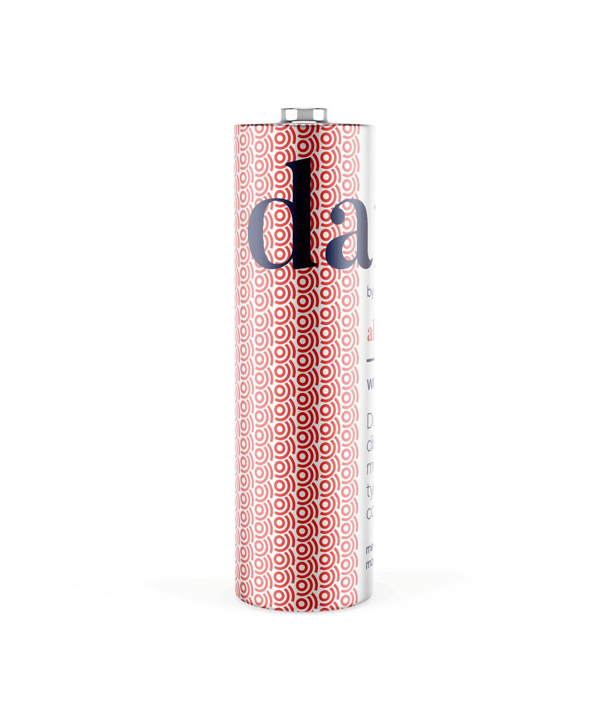
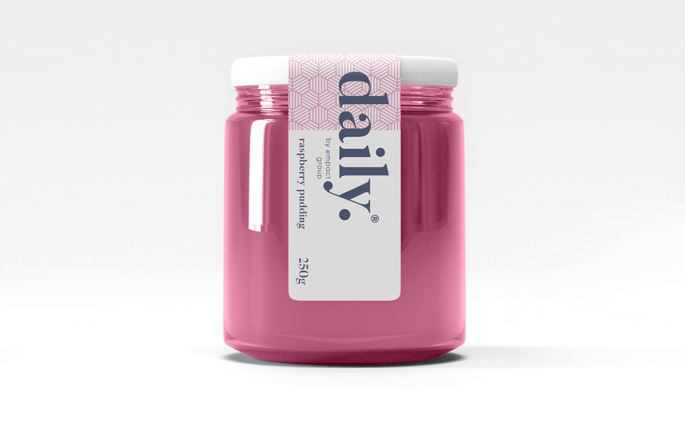
daily brand structure
The design uses generous white space to fit dense copy on small labels.
Scalable branding elements create extra room, with the product name aligned above the holding company byline at the label’s base.

daily product pattern
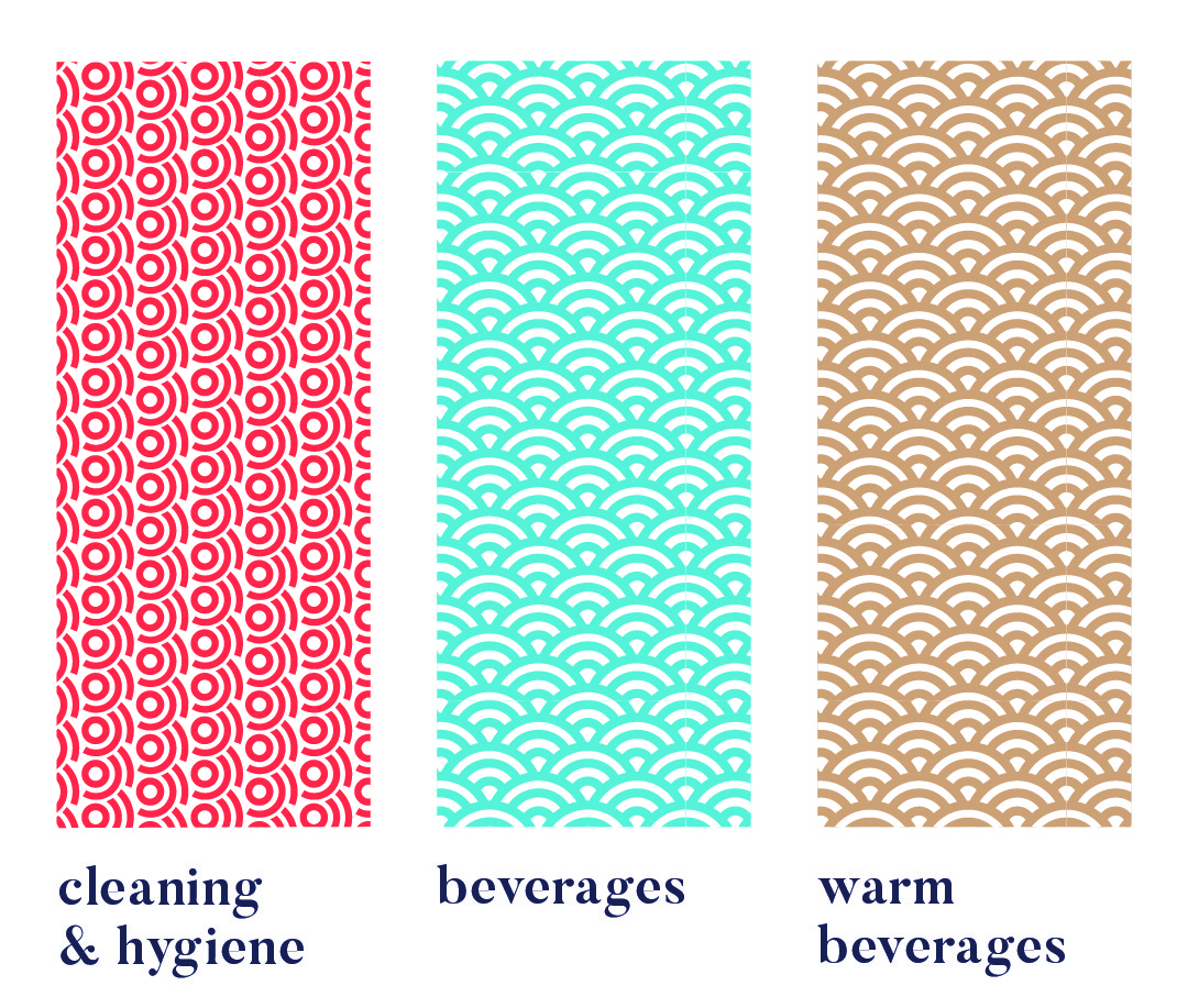
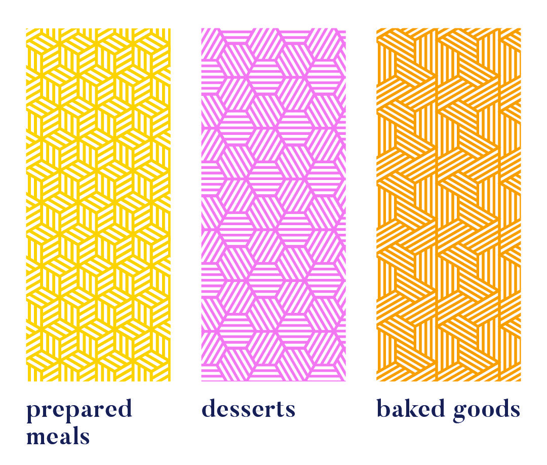
Each range uses a unique pattern for quick visual recognition.
Colour variations within a pattern distinguish sub-products, like hot vs cold drinks or juice flavours. Cleaning & Hygiene products use a red pattern from the Supercare logo, signalling both chemical use and brand affiliation.
daily product creative


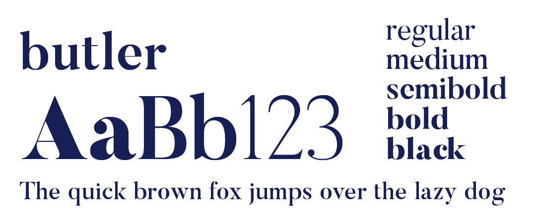
daily typography

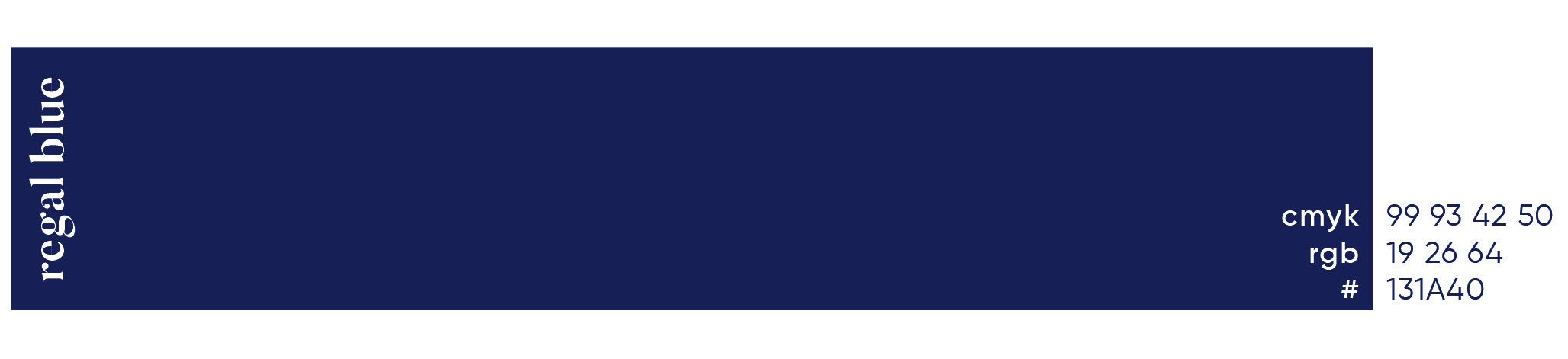
daily primary colour
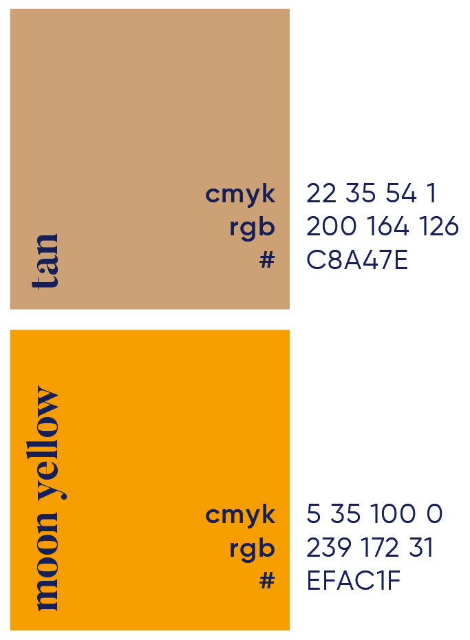
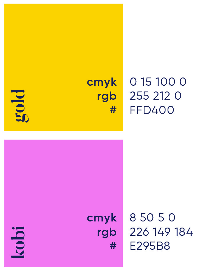
daily secondary colour palette

daily brand pattern


More Works

Amplifin
Amplifin helps businesses unlock the power of payments. A modern fintech brand that simplifies collections and drives financial inclusion through smart, secure solutions.
Problem
With their early-stage branding no longer fit for market, Amplifin needed a sharper, more professional identity to reflect their maturity and credibility in South Africa’s national payment system.
We created a sleek, modular identity that balances fintech precision with human warmth. The wordmark is framed by an implied bracket and paired with a superscript plus symbol, a subtle visual metaphor for amplifying client potential. Lowercase typography keeps the brand modern and approachable, while bold blues and a vibrant golden yellow create strong visual recognition.
To expand the identity, we created a flexible visual language using scalable brackets and plus signs. These elements serve as graphic devices, patterns, and framing tools, enhancing the brand through consistency and adaptability. This system brings structure and energy to everything from billboards to onboarding screens, reinforcing Amplifin’s role as both a dependable infrastructure provider and a catalyst for client growth.
Roles
Creative Direction - Shakera Kaloo
Design - Reinhard Greyling
product logo
The identity used a simple, elegant and recognisable wordmark that could work across a wide variety of products and function easily as a conglomerate brand mark.
The pattern would serve to identify the product range and in some instances the pattern colour is used to distinguish mutiple products under the same range, such as flavours of fruit juice.
daily brand structure
The design uses generous white space to fit dense copy on small labels. Scalable branding elements create extra room, with the product name aligned above the holding company byline at the label’s base.
daily product pattern
Each range uses a unique pattern for quick visual recognition.
Colour variations within a pattern distinguish sub-products, like hot vs cold drinks or juice flavours. Cleaning & Hygiene products use a red pattern from the Supercare logo, signalling both chemical use and brand affiliation.
daily product creative
daily typography
daily primary colour
daily secondary colour palette
daily brand pattern
More Works
Amplifin
Amplifin helps businesses unlock the power of payments. A modern fintech brand that simplifies collections and drives financial inclusion through smart, secure solutions.
Problem
With their early-stage branding no longer fit for market, Amplifin needed a sharper, more professional identity to reflect their maturity and credibility in South Africa’s national payment system.
We created a sleek, modular identity that balances fintech precision with human warmth. The wordmark is framed by an implied bracket and paired with a superscript plus symbol, a subtle visual metaphor for amplifying client potential. Lowercase typography keeps the brand modern and approachable, while bold blues and a vibrant golden yellow create strong visual recognition.
To expand the identity, we created a flexible visual language using scalable brackets and plus signs. These elements serve as graphic devices, patterns, and framing tools, enhancing the brand through consistency and adaptability. This system brings structure and energy to everything from billboards to onboarding screens, reinforcing Amplifin’s role as both a dependable infrastructure provider and a catalyst for client growth.
Roles
Creative Direction - Shakera Kaloo
Design - Reinhard Greyling
product logo
The identity used a simple, elegant and recognizable wordmark that could work across a wide varfiety of products and function easily as a conglomerate brand mark.
The pattern would serve to identify the product range and in some instances the pattern colour is used to distinguish mutiple products under the same range, such as flavours of fruit juice.
daily brand structure
The design uses generous white space to fit dense copy on small labels.
Scalable branding elements create extra room, with the product name aligned above the holding company byline at the label’s base.
daily product pattern
Each range uses a unique pattern for quick visual recognition.
Colour variations within a pattern distinguish sub-products, like hot vs cold drinks or juice flavours. Cleaning & Hygiene products use a red pattern from the Supercare logo, signalling both chemical use and brand affiliation.
daily product creative
daily typography
daily primary colour

daily secondary colour
palette
daily brand pattern
More Works