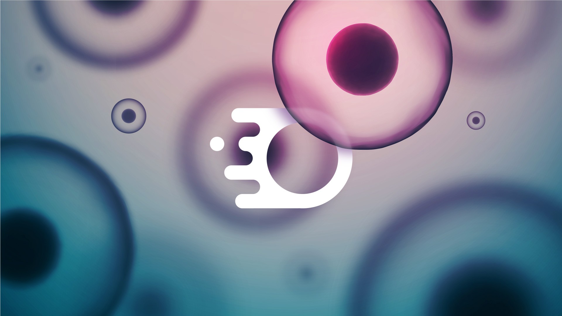
Biodx
Biodx is breaking the chemical chain. A biotech brand harnessing natural ingredients to create the world’s first environmentally friendly disinfectant, built to protect people and the planet.
Problem
The magic of untouched meadows, serene forests, and vibrant ecosystems is fading, replaced by concrete jungles and digital distractions. This disconnect not only impacts mental and physical well-being but also diminishes our appreciation for the environment.
In today’s fast-paced, technology-driven world, the connection between humans and nature has been severely eroded. Urban sprawl, pollution, and the demands of modern life have left little room for the tranquility and inspiration that natural landscapes once provided. People are increasingly feeling disconnected from the outdoors, leading to stress, burnout, and a longing for spaces that offer peace and rejuvenation. The magic of untouched meadows, serene forests, and vibrant ecosystems is fading, replaced by concrete jungles and digital distractions. This disconnect not only impacts mental and physical well-being but also diminishes our appreciation for the environment. Mystic Meadows aims to bridge this gap, rekindling the lost bond between humanity and the natural world.
Roles
Creative Direction - Shakera Kaloo
Design - Reinhard Greyling

product logo

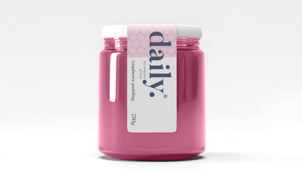
The identity used a simple, elegant and recognisable wordmark that could work across a wide variety of products and function easily as a conglomerate brand mark.
The pattern would serve to identify the product range and in some instances the pattern colour is used to distinguish mutiple products under the same range, such as flavours of fruit juice.
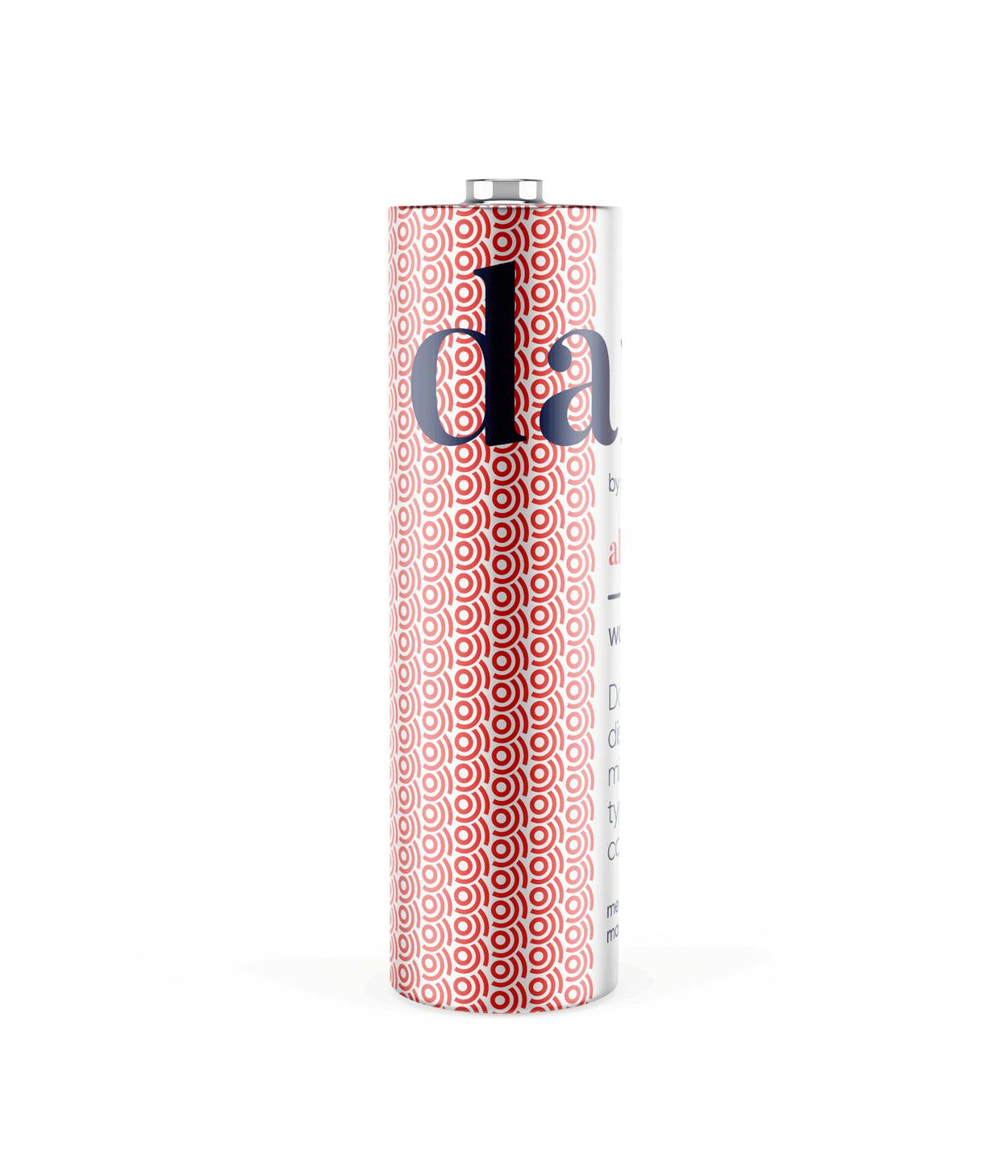
daily brand structure
The design uses generous white space to fit dense copy on small labels.
Scalable branding elements create extra room, with the product name aligned above the holding company byline at the label’s base.

daily product pattern
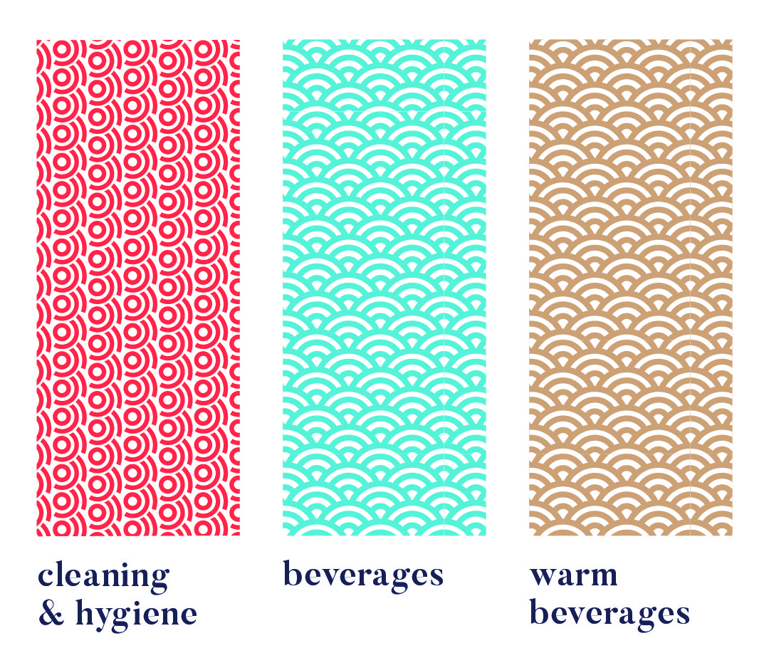
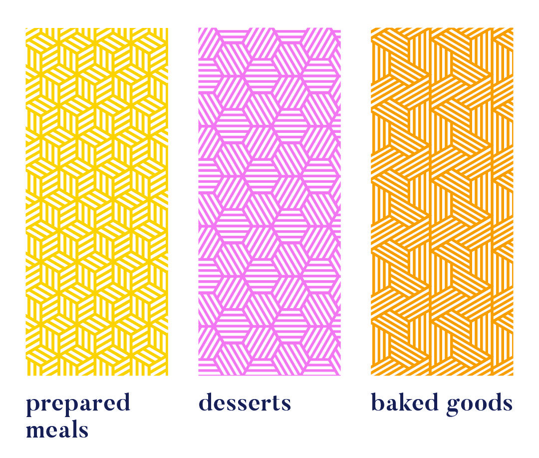
Each range uses a unique pattern for quick visual recognition.
Colour variations within a pattern distinguish sub-products, like hot vs cold drinks or juice flavours. Cleaning & Hygiene products use a red pattern from the Supercare logo, signalling both chemical use and brand affiliation.
daily product creative


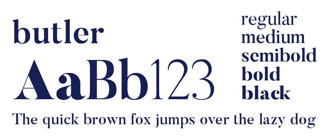
daily typography

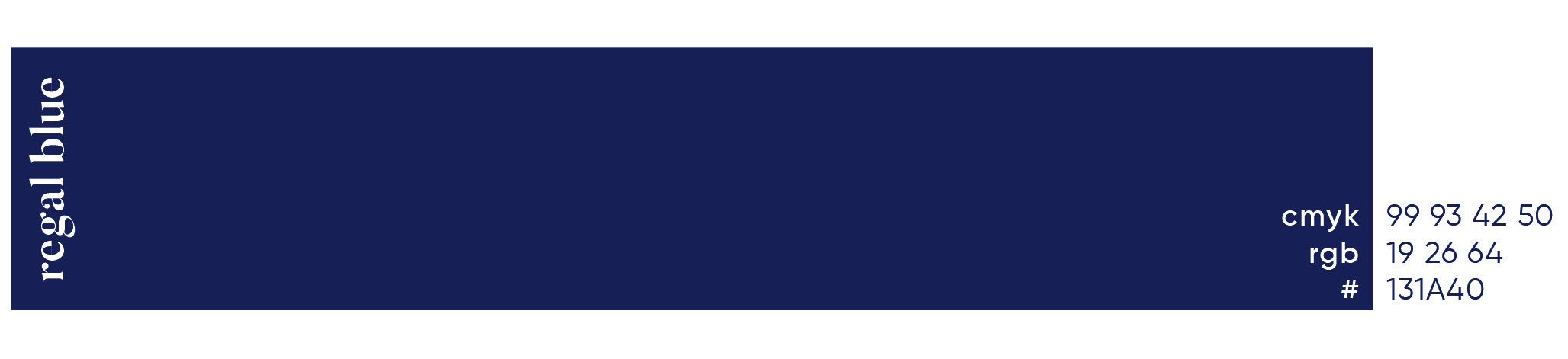
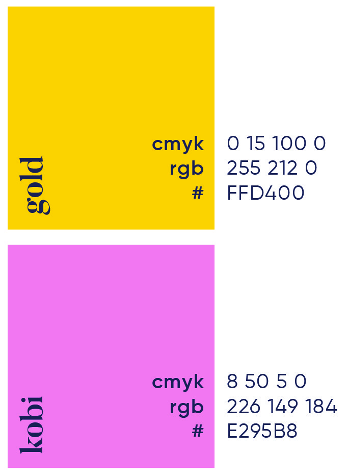
daily primary colour
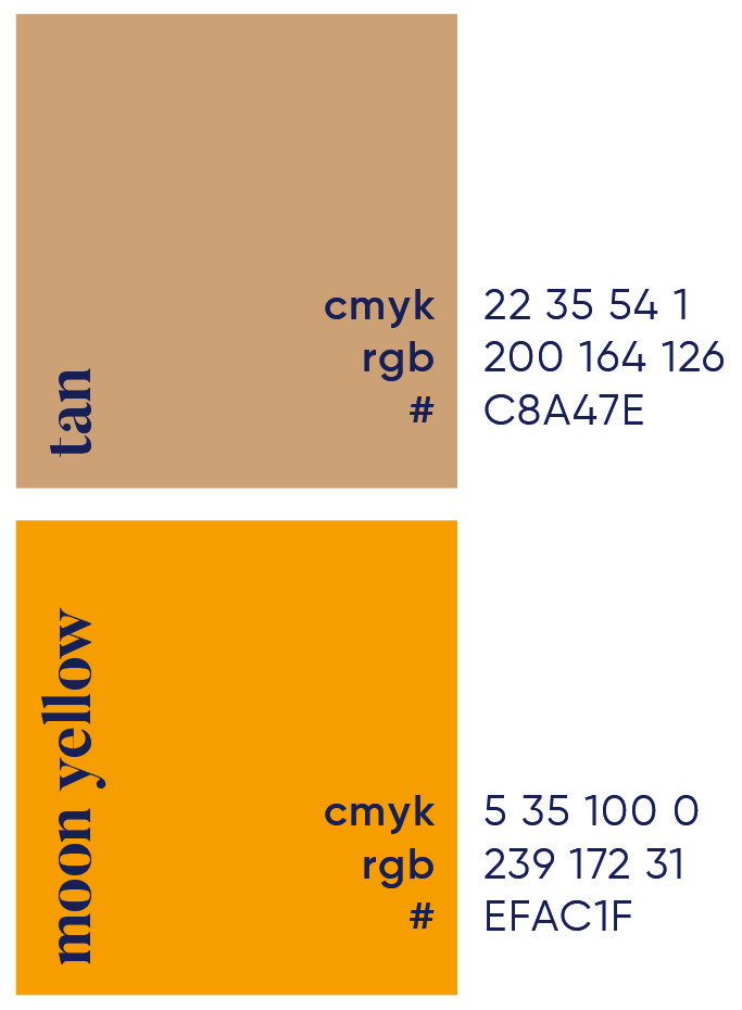
daily secondary colour palette

daily brand pattern


More Works

Biodx
Biodx is breaking the chemical chain. A biotech brand harnessing natural ingredients to create the world’s first environmentally friendly disinfectant, built to protect people and the planet.
Problem
The magic of untouched meadows, serene forests, and vibrant ecosystems is fading, replaced by concrete jungles and digital distractions. This disconnect not only impacts mental and physical well-being but also diminishes our appreciation for the environment.
In today’s fast-paced, technology-driven world, the connection between humans and nature has been severely eroded. Urban sprawl, pollution, and the demands of modern life have left little room for the tranquility and inspiration that natural landscapes once provided. People are increasingly feeling disconnected from the outdoors, leading to stress, burnout, and a longing for spaces that offer peace and rejuvenation. The magic of untouched meadows, serene forests, and vibrant ecosystems is fading, replaced by concrete jungles and digital distractions. This disconnect not only impacts mental and physical well-being but also diminishes our appreciation for the environment. Mystic Meadows aims to bridge this gap, rekindling the lost bond between humanity and the natural world.
Roles
Creative Direction - Shakera Kaloo
Design - Reinhard Greyling
product logo
The identity used a simple, elegant and recognisable wordmark that could work across a wide variety of products and function easily as a conglomerate brand mark.
The pattern would serve to identify the product range and in some instances the pattern colour is used to distinguish mutiple products under the same range, such as flavours of fruit juice.
daily brand structure
The design uses generous white space to fit dense copy on small labels. Scalable branding elements create extra room, with the product name aligned above the holding company byline at the label’s base.
daily product pattern
Each range uses a unique pattern for quick visual recognition.
Colour variations within a pattern distinguish sub-products, like hot vs cold drinks or juice flavours. Cleaning & Hygiene products use a red pattern from the Supercare logo, signalling both chemical use and brand affiliation.
daily product creative
daily typography
daily primary colour
daily secondary colour palette
daily brand pattern
More Works
Biodx
Biodx is breaking the chemical chain. A biotech brand harnessing natural ingredients to create the world’s first environmentally friendly disinfectant, built to protect people and the planet.
Problem
The magic of untouched meadows, serene forests, and vibrant ecosystems is fading, replaced by concrete jungles and digital distractions. This disconnect not only impacts mental and physical well-being but also diminishes our appreciation for the environment.
In today’s fast-paced, technology-driven world, the connection between humans and nature has been severely eroded. Urban sprawl, pollution, and the demands of modern life have left little room for the tranquility and inspiration that natural landscapes once provided. People are increasingly feeling disconnected from the outdoors, leading to stress, burnout, and a longing for spaces that offer peace and rejuvenation. The magic of untouched meadows, serene forests, and vibrant ecosystems is fading, replaced by concrete jungles and digital distractions. This disconnect not only impacts mental and physical well-being but also diminishes our appreciation for the environment. Mystic Meadows aims to bridge this gap, rekindling the lost bond between humanity and the natural world.
Roles
Creative Direction - Shakera Kaloo
Design - Reinhard Greyling
product logo
The identity used a simple, elegant and recognizable wordmark that could work across a wide varfiety of products and function easily as a conglomerate brand mark.
The pattern would serve to identify the product range and in some instances the pattern colour is used to distinguish mutiple products under the same range, such as flavours of fruit juice.
daily brand structure
The design uses generous white space to fit dense copy on small labels.
Scalable branding elements create extra room, with the product name aligned above the holding company byline at the label’s base.
daily product pattern
Each range uses a unique pattern for quick visual recognition.
Colour variations within a pattern distinguish sub-products, like hot vs cold drinks or juice flavours. Cleaning & Hygiene products use a red pattern from the Supercare logo, signalling both chemical use and brand affiliation.
daily product creative
daily typography
daily primary colour

daily secondary colour
palette
daily brand pattern
More Works