
Durban Poison
Willow Studio is a creative hub dedicated to crafting visually striking and innovative designs. With a keen eye for detail, it blends ideas to create experiences.®
Problem
By addressing these challenges head-on, we empower brands to elevate their presence, build stronger connections, and achieve their creative vision with confidence.
In today’s fast-paced digital world, standing out as a creative studio is more challenging than ever. Many brands struggle with outdated designs, inconsistent branding, and a lack of compelling storytelling that truly connects with their audience. Without a strong visual identity and seamless user experience, potential clients lose interest, leading to missed opportunities and decreased engagement. Additionally, many creative studios face difficulties in balancing aesthetics with functionality, often resulting in visually appealing but impractical solutions. Willow Studio was conceived to bridge this gap by providing innovative, high-quality design solutions that not only look stunning but also drive real impact. We understand the importance of storytelling, strategic branding, and immersive experiences that leave a lasting impression.
Roles
Creative Direction - Shakera Kaloo
Design - Reinhard Greyling

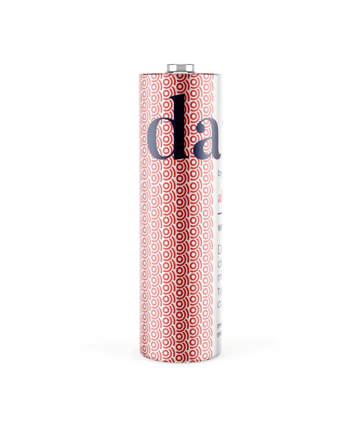
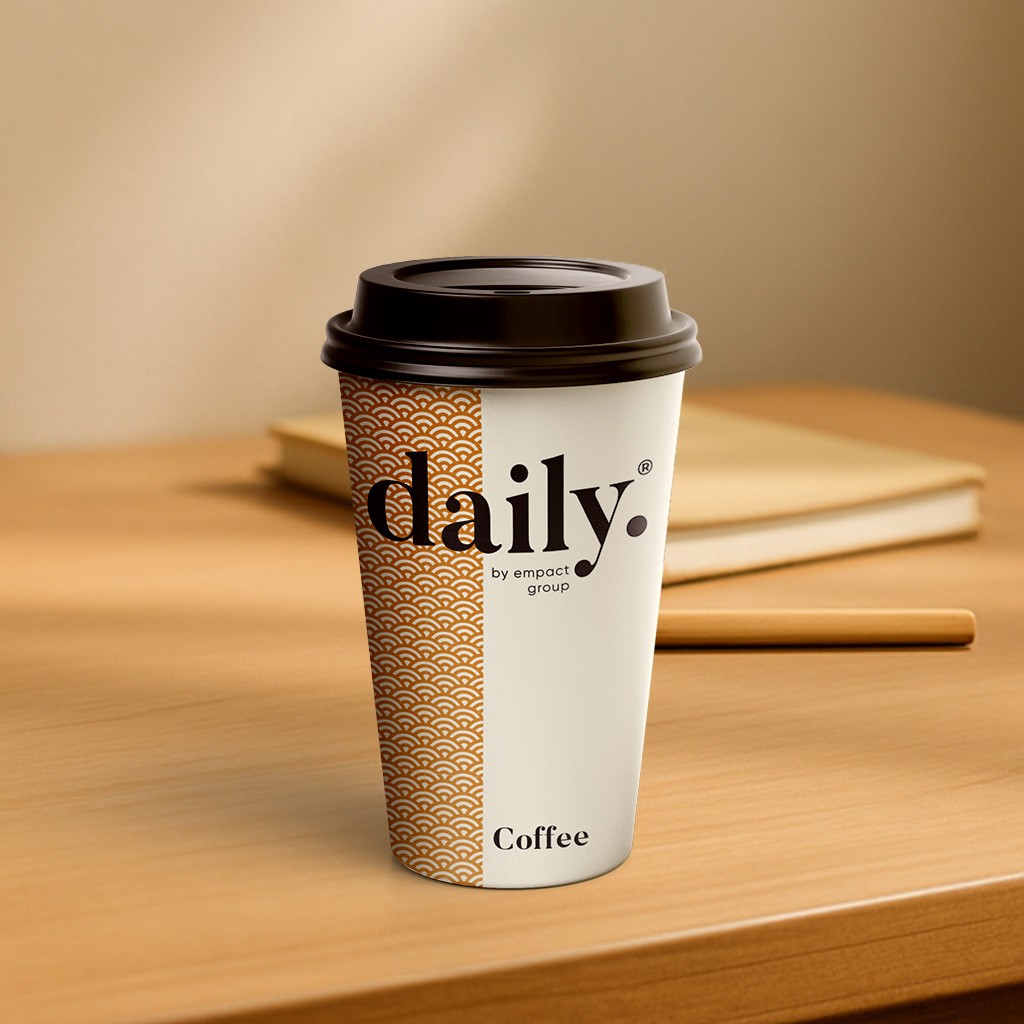
product logo

The identity used a simple, elegant and recognisable wordmark that could work across a wide variety of products and function easily as a conglomerate brand mark.
The pattern would serve to identify the product range and in some instances the pattern colour is used to distinguish mutiple products under the same range, such as flavours of fruit juice.
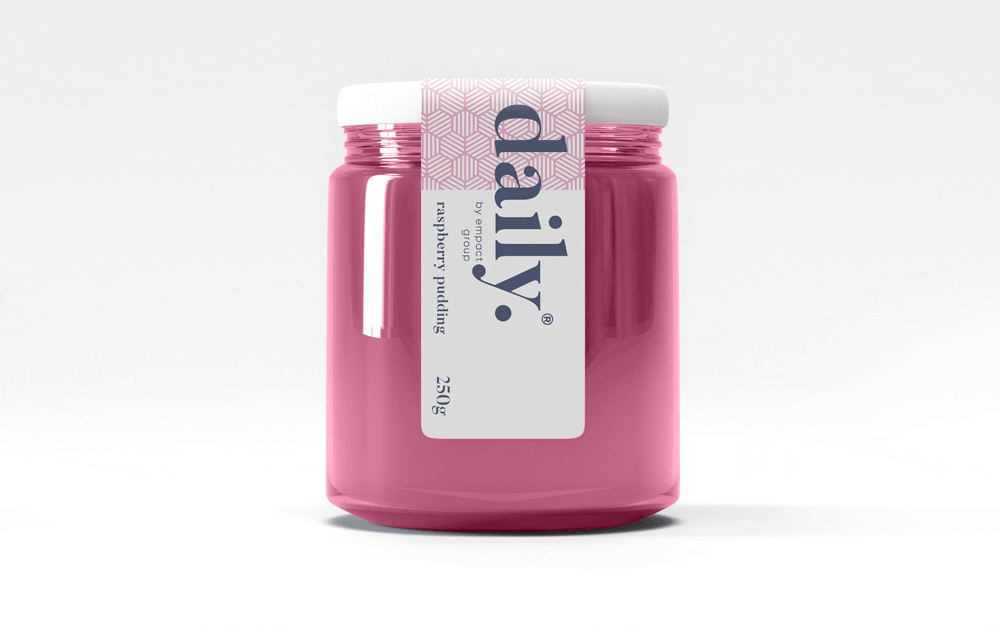
daily brand structure
The design uses generous white space to fit dense copy on small labels.
Scalable branding elements create extra room, with the product name aligned above the holding company byline at the label’s base.

daily product pattern
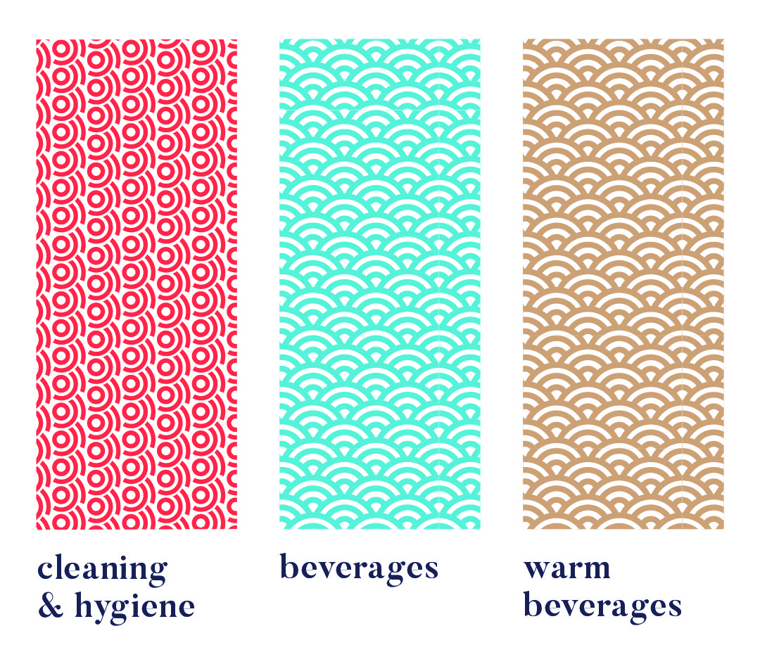
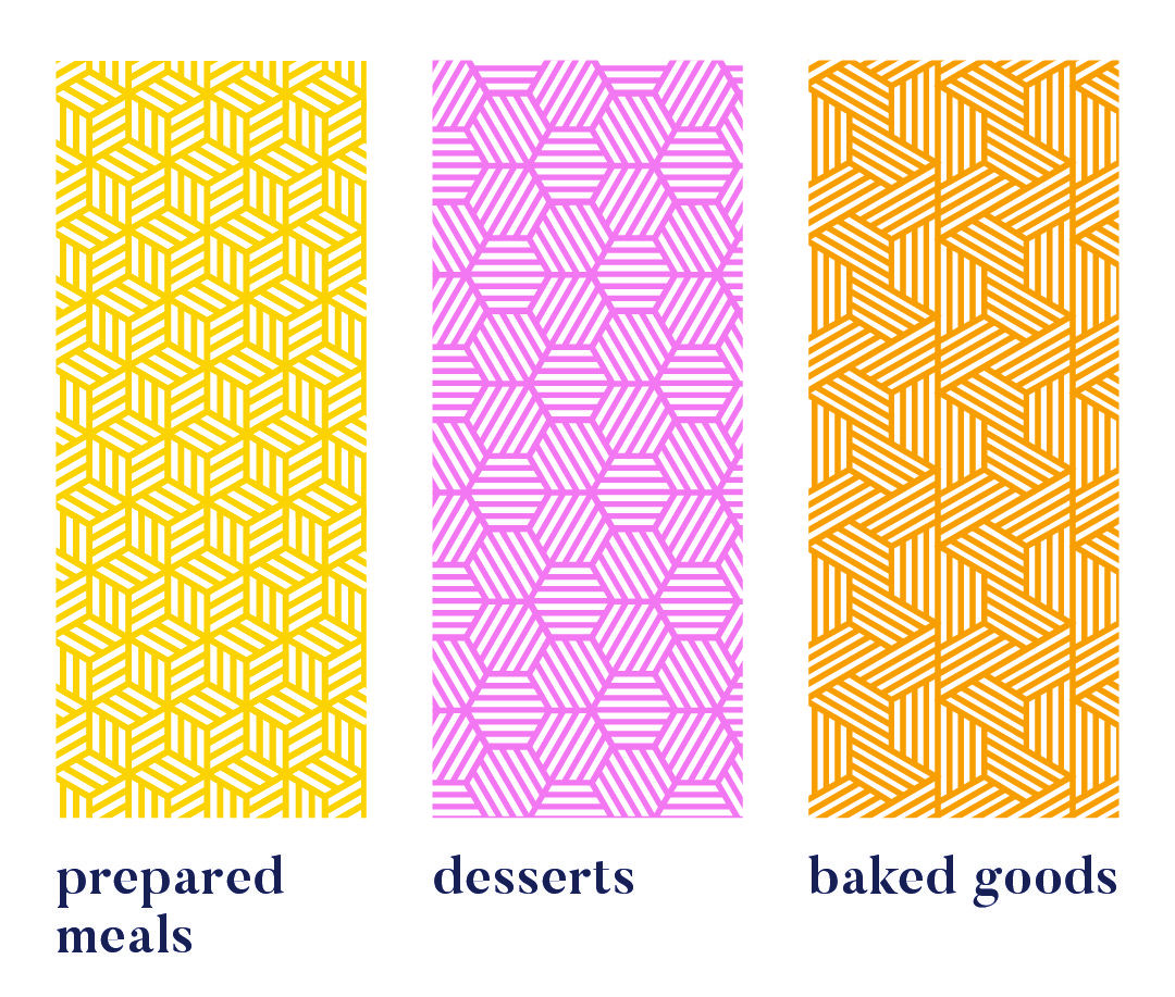
Each range uses a unique pattern for quick visual recognition.
Colour variations within a pattern distinguish sub-products, like hot vs cold drinks or juice flavours. Cleaning & Hygiene products use a red pattern from the Supercare logo, signalling both chemical use and brand affiliation.
daily product creative


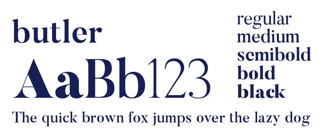
daily typography

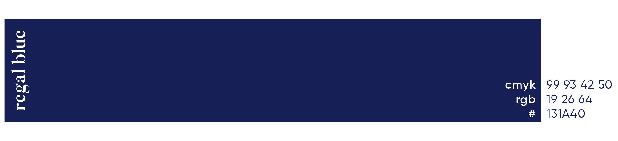
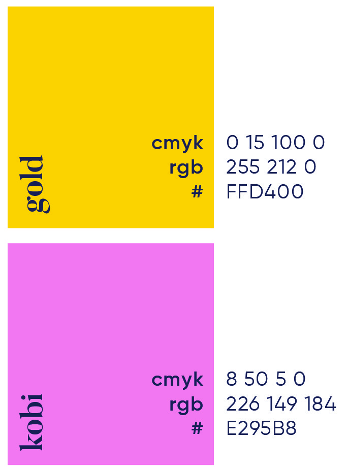
daily primary colour
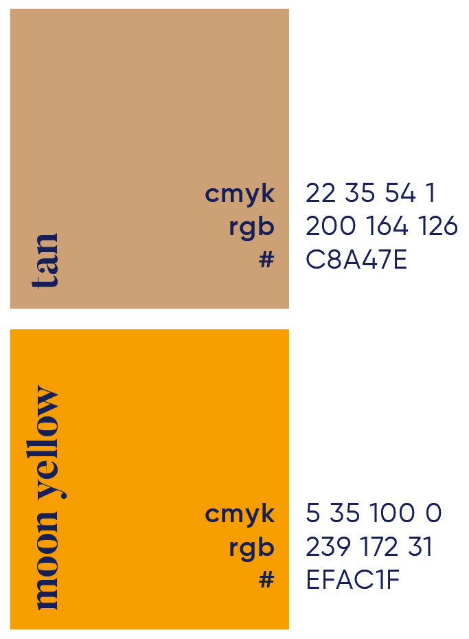
daily secondary colour palette

daily brand pattern


More Works

Durban Poison
Willow Studio is a creative hub dedicated to crafting visually striking and innovative designs. With a keen eye for detail, it blends ideas to create experiences.®
Problem
By addressing these challenges head-on, we empower brands to elevate their presence, build stronger connections, and achieve their creative vision with confidence.
In today’s fast-paced digital world, standing out as a creative studio is more challenging than ever. Many brands struggle with outdated designs, inconsistent branding, and a lack of compelling storytelling that truly connects with their audience. Without a strong visual identity and seamless user experience, potential clients lose interest, leading to missed opportunities and decreased engagement. Additionally, many creative studios face difficulties in balancing aesthetics with functionality, often resulting in visually appealing but impractical solutions. Willow Studio was conceived to bridge this gap by providing innovative, high-quality design solutions that not only look stunning but also drive real impact. We understand the importance of storytelling, strategic branding, and immersive experiences that leave a lasting impression.
Roles
Creative Direction - Shakera Kaloo
Design - Reinhard Greyling
product logo
The identity used a simple, elegant and recognisable wordmark that could work across a wide variety of products and function easily as a conglomerate brand mark.
The pattern would serve to identify the product range and in some instances the pattern colour is used to distinguish mutiple products under the same range, such as flavours of fruit juice.
daily brand structure
The design uses generous white space to fit dense copy on small labels. Scalable branding elements create extra room, with the product name aligned above the holding company byline at the label’s base.
daily product pattern
Each range uses a unique pattern for quick visual recognition.
Colour variations within a pattern distinguish sub-products, like hot vs cold drinks or juice flavours. Cleaning & Hygiene products use a red pattern from the Supercare logo, signalling both chemical use and brand affiliation.
daily product creative
daily typography
daily primary colour
daily secondary colour palette
daily brand pattern
More Works
Durban Poison
Willow Studio is a creative hub dedicated to crafting visually striking and innovative designs. With a keen eye for detail, it blends ideas to create experiences.®
Problem
By addressing these challenges head-on, we empower brands to elevate their presence, build stronger connections, and achieve their creative vision with confidence.
In today’s fast-paced digital world, standing out as a creative studio is more challenging than ever. Many brands struggle with outdated designs, inconsistent branding, and a lack of compelling storytelling that truly connects with their audience. Without a strong visual identity and seamless user experience, potential clients lose interest, leading to missed opportunities and decreased engagement. Additionally, many creative studios face difficulties in balancing aesthetics with functionality, often resulting in visually appealing but impractical solutions. Willow Studio was conceived to bridge this gap by providing innovative, high-quality design solutions that not only look stunning but also drive real impact. We understand the importance of storytelling, strategic branding, and immersive experiences that leave a lasting impression.
Roles
Creative Direction - Shakera Kaloo
Design - Reinhard Greyling
product logo
The identity used a simple, elegant and recognizable wordmark that could work across a wide varfiety of products and function easily as a conglomerate brand mark.
The pattern would serve to identify the product range and in some instances the pattern colour is used to distinguish mutiple products under the same range, such as flavours of fruit juice.
daily brand structure
The design uses generous white space to fit dense copy on small labels.
Scalable branding elements create extra room, with the product name aligned above the holding company byline at the label’s base.
daily product pattern
Each range uses a unique pattern for quick visual recognition.
Colour variations within a pattern distinguish sub-products, like hot vs cold drinks or juice flavours. Cleaning & Hygiene products use a red pattern from the Supercare logo, signalling both chemical use and brand affiliation.
daily product creative
daily typography
daily primary colour

daily secondary colour
palette
daily brand pattern
More Works