
Nashua
Our space is designed to blend timeless elegance with modern efficiency, offering a seamless experience for both clients and professionals.®
Problem
Many legal environments remain trapped in outdated designs that fail to meet the demands of today’s dynamic and client-focused practices. It’s time to leave behind the frustrations of the past and embrace a future where design and purpose go hand in hand.
In today’s fast-evolving legal landscape, many law firms and practices are hindered by outdated, uninspiring workspaces that fail to reflect the professionalism and innovation they strive to embody. Traditional legal environments often feel cold, impersonal, and disconnected from the needs of modern clients and professionals. Cramped offices, inefficient layouts, and a lack of aesthetic appeal can create a stressful atmosphere, reducing productivity and diminishing client trust. These spaces not only fail to inspire confidence but also miss the opportunity to foster collaboration, creativity, and a sense of calm. Maison Law recognizes this disconnect and aims to redefine legal spaces, transforming them into environments that align with the sophistication and efficiency of today’s legal practices.
Roles
Creative Direction - Shakera Kaloo
Design - Reinhard Greyling

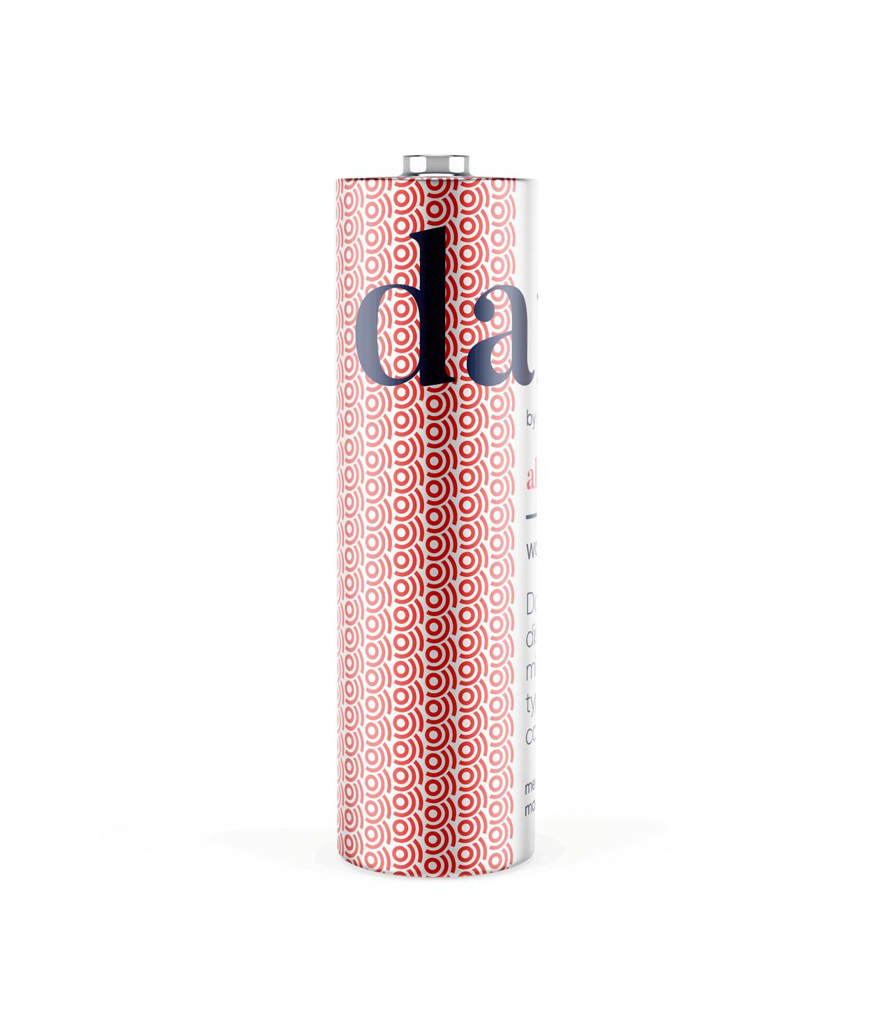
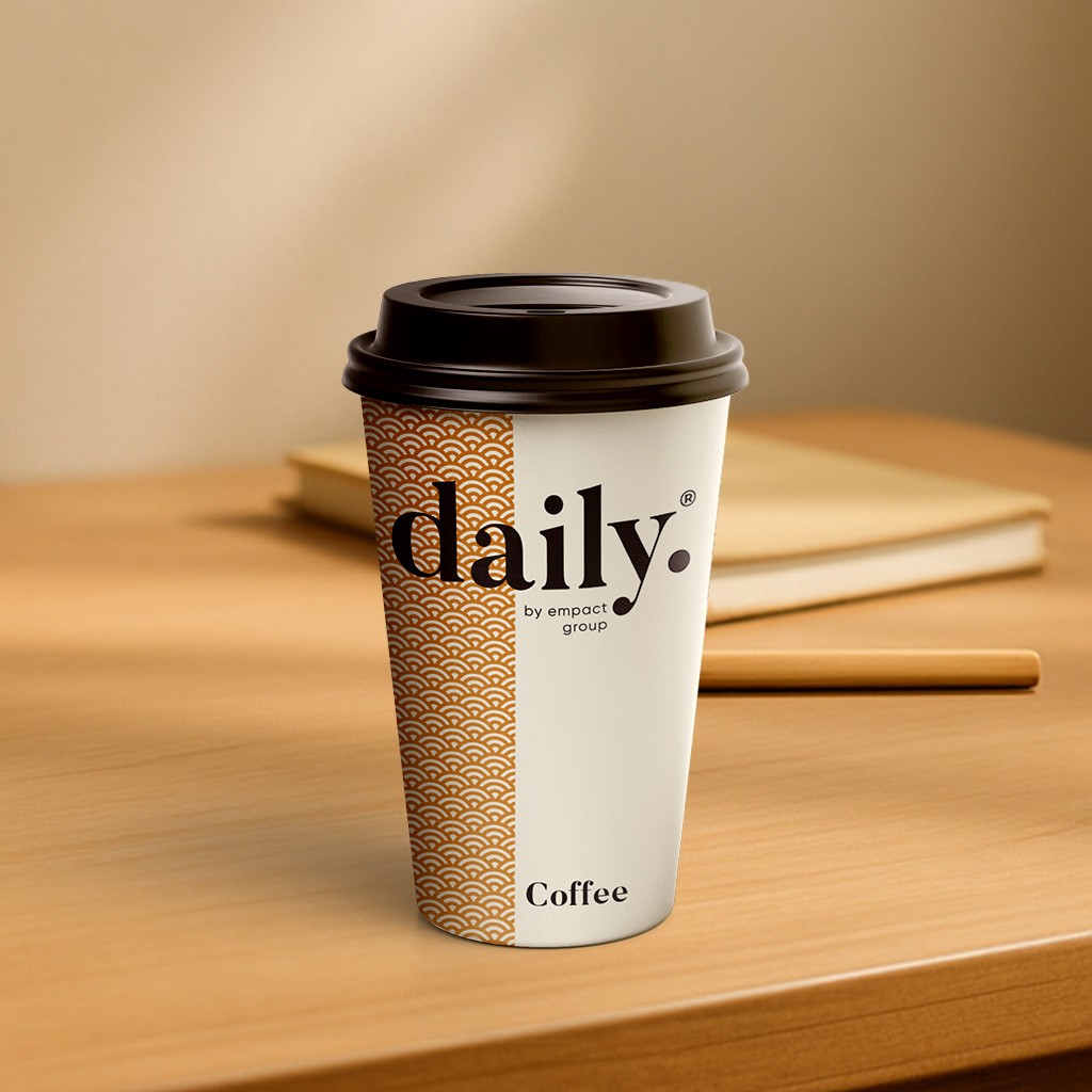
product logo

The identity used a simple, elegant and recognisable wordmark that could work across a wide variety of products and function easily as a conglomerate brand mark.
The pattern would serve to identify the product range and in some instances the pattern colour is used to distinguish mutiple products under the same range, such as flavours of fruit juice.
daily brand structure
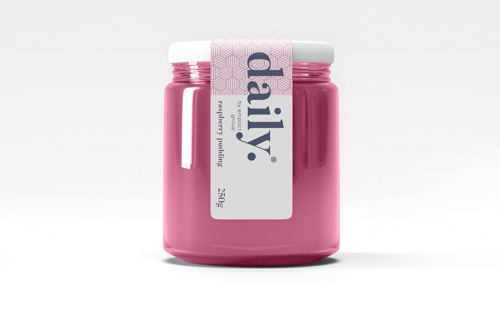
The design uses generous white space to fit dense copy on small labels.
Scalable branding elements create extra room, with the product name aligned above the holding company byline at the label’s base.

daily product pattern
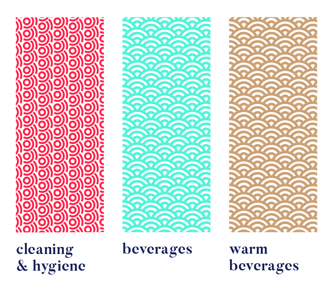
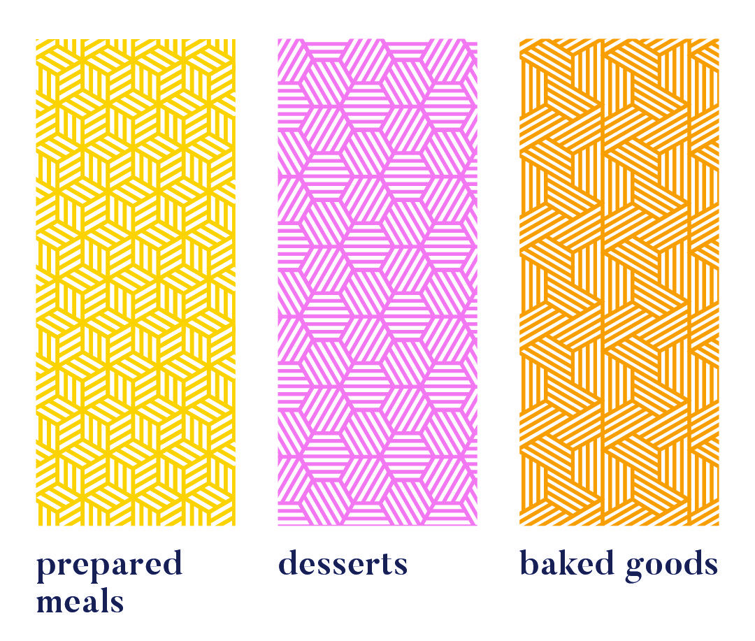
Each range uses a unique pattern for quick visual recognition.
Colour variations within a pattern distinguish sub-products, like hot vs cold drinks or juice flavours. Cleaning & Hygiene products use a red pattern from the Supercare logo, signalling both chemical use and brand affiliation.
daily product creative


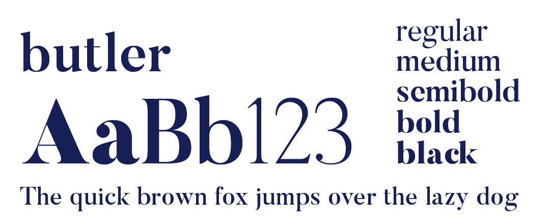
daily typography

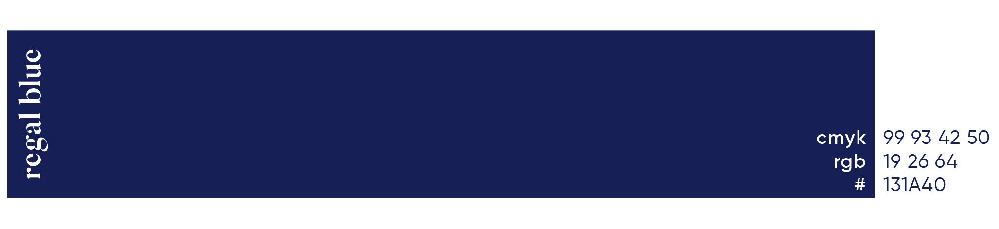
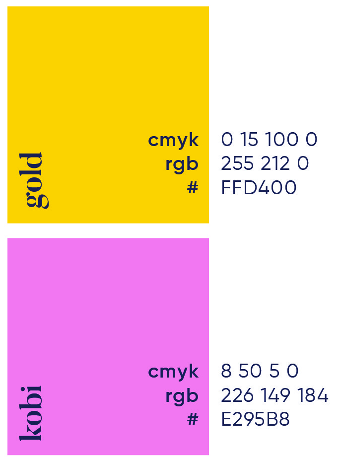
daily primary colour
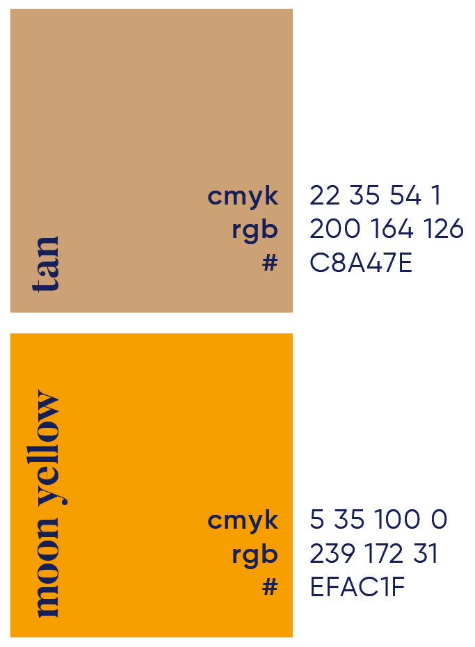
daily secondary colour palette

daily brand pattern


More Works

Nashua
Our space is designed to blend timeless elegance with modern efficiency, offering a seamless experience for both clients and professionals.®
Problem
Many legal environments remain trapped in outdated designs that fail to meet the demands of today’s dynamic and client-focused practices. It’s time to leave behind the frustrations of the past and embrace a future where design and purpose go hand in hand.
In today’s fast-evolving legal landscape, many law firms and practices are hindered by outdated, uninspiring workspaces that fail to reflect the professionalism and innovation they strive to embody. Traditional legal environments often feel cold, impersonal, and disconnected from the needs of modern clients and professionals. Cramped offices, inefficient layouts, and a lack of aesthetic appeal can create a stressful atmosphere, reducing productivity and diminishing client trust. These spaces not only fail to inspire confidence but also miss the opportunity to foster collaboration, creativity, and a sense of calm. Maison Law recognizes this disconnect and aims to redefine legal spaces, transforming them into environments that align with the sophistication and efficiency of today’s legal practices.
Roles
Creative Direction - Shakera Kaloo
Design - Reinhard Greyling
product logo
The identity used a simple, elegant and recognisable wordmark that could work across a wide variety of products and function easily as a conglomerate brand mark.
The pattern would serve to identify the product range and in some instances the pattern colour is used to distinguish mutiple products under the same range, such as flavours of fruit juice.
daily brand structure
The design uses generous white space to fit dense copy on small labels. Scalable branding elements create extra room, with the product name aligned above the holding company byline at the label’s base.
daily product pattern
Each range uses a unique pattern for quick visual recognition.
Colour variations within a pattern distinguish sub-products, like hot vs cold drinks or juice flavours. Cleaning & Hygiene products use a red pattern from the Supercare logo, signalling both chemical use and brand affiliation.
daily product creative
daily typography
daily primary colour
daily secondary colour palette
daily brand pattern
More Works
Nashua
Our space is designed to blend timeless elegance with modern efficiency, offering a seamless experience for both clients and professionals.®
Problem
Many legal environments remain trapped in outdated designs that fail to meet the demands of today’s dynamic and client-focused practices. It’s time to leave behind the frustrations of the past and embrace a future where design and purpose go hand in hand.
In today’s fast-evolving legal landscape, many law firms and practices are hindered by outdated, uninspiring workspaces that fail to reflect the professionalism and innovation they strive to embody. Traditional legal environments often feel cold, impersonal, and disconnected from the needs of modern clients and professionals. Cramped offices, inefficient layouts, and a lack of aesthetic appeal can create a stressful atmosphere, reducing productivity and diminishing client trust. These spaces not only fail to inspire confidence but also miss the opportunity to foster collaboration, creativity, and a sense of calm. Maison Law recognizes this disconnect and aims to redefine legal spaces, transforming them into environments that align with the sophistication and efficiency of today’s legal practices.
Roles
Creative Direction - Shakera Kaloo
Design - Reinhard Greyling
product logo
The identity used a simple, elegant and recognizable wordmark that could work across a wide varfiety of products and function easily as a conglomerate brand mark.
The pattern would serve to identify the product range and in some instances the pattern colour is used to distinguish mutiple products under the same range, such as flavours of fruit juice.
daily brand structure
The design uses generous white space to fit dense copy on small labels.
Scalable branding elements create extra room, with the product name aligned above the holding company byline at the label’s base.
daily product pattern
Each range uses a unique pattern for quick visual recognition.
Colour variations within a pattern distinguish sub-products, like hot vs cold drinks or juice flavours. Cleaning & Hygiene products use a red pattern from the Supercare logo, signalling both chemical use and brand affiliation.
daily product creative
daily typography
daily primary colour

daily secondary colour
palette
daily brand pattern
More Works