
Qunu Riders
Qunu Riders was born from a love of the long road. An affordable adventure touring company offering guided motorcycle journeys through South Africa and Spain, built for riders chasing freedom, not frills.
Problem
Founded by two brothers with a shared passion for adventure biking, Qunu Riders needed a brand that felt rugged and exciting, but also grounded in a modern African aesthetic. The identity had to stand apart from premium touring competitors, while still promising unforgettable, scenic experiences.
We designed a brand rooted in the spirit of exploration, a celebration of detours, back roads and the slower, scenic way around. The logomark forms a continuous single line spelling “Qunu,” shaped into a rhythmic wave that echoes the curves of distant roads. It’s segmented into three bold colours, each tied to a dominant landscape on the tours: burgundy for rocky mountain passes, yellow for dry desert routes and teal blue for coastal stretches and lakeside detours.
These segments became the foundation of the visual language, repeated as flowing patterns and overlaid on photography to evoke motion and terrain. The result is a flexible, expressive identity that captures the joy of the journey, not just the destination.
Roles
Creative Direction - Shakera Kaloo
Design - Reinhard Greyling

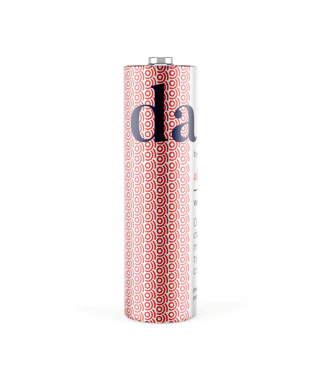
product logo

The identity used a simple, elegant and recognisable wordmark that could work across a wide variety of products and function easily as a conglomerate brand mark.
The pattern would serve to identify the product range and in some instances the pattern colour is used to distinguish mutiple products under the same range, such as flavours of fruit juice.
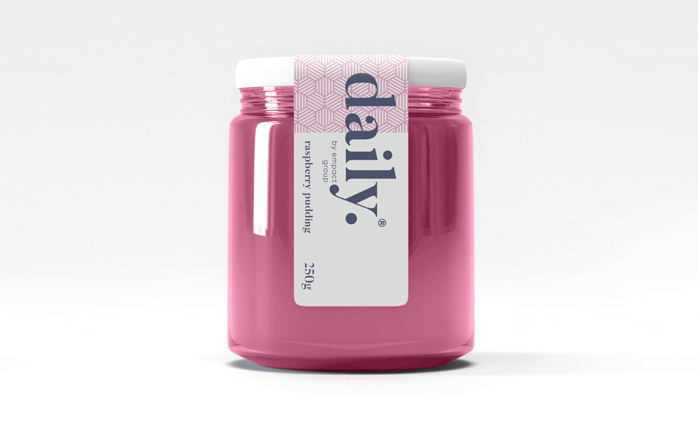
daily brand structure
The design uses generous white space to fit dense copy on small labels.
Scalable branding elements create extra room, with the product name aligned above the holding company byline at the label’s base.

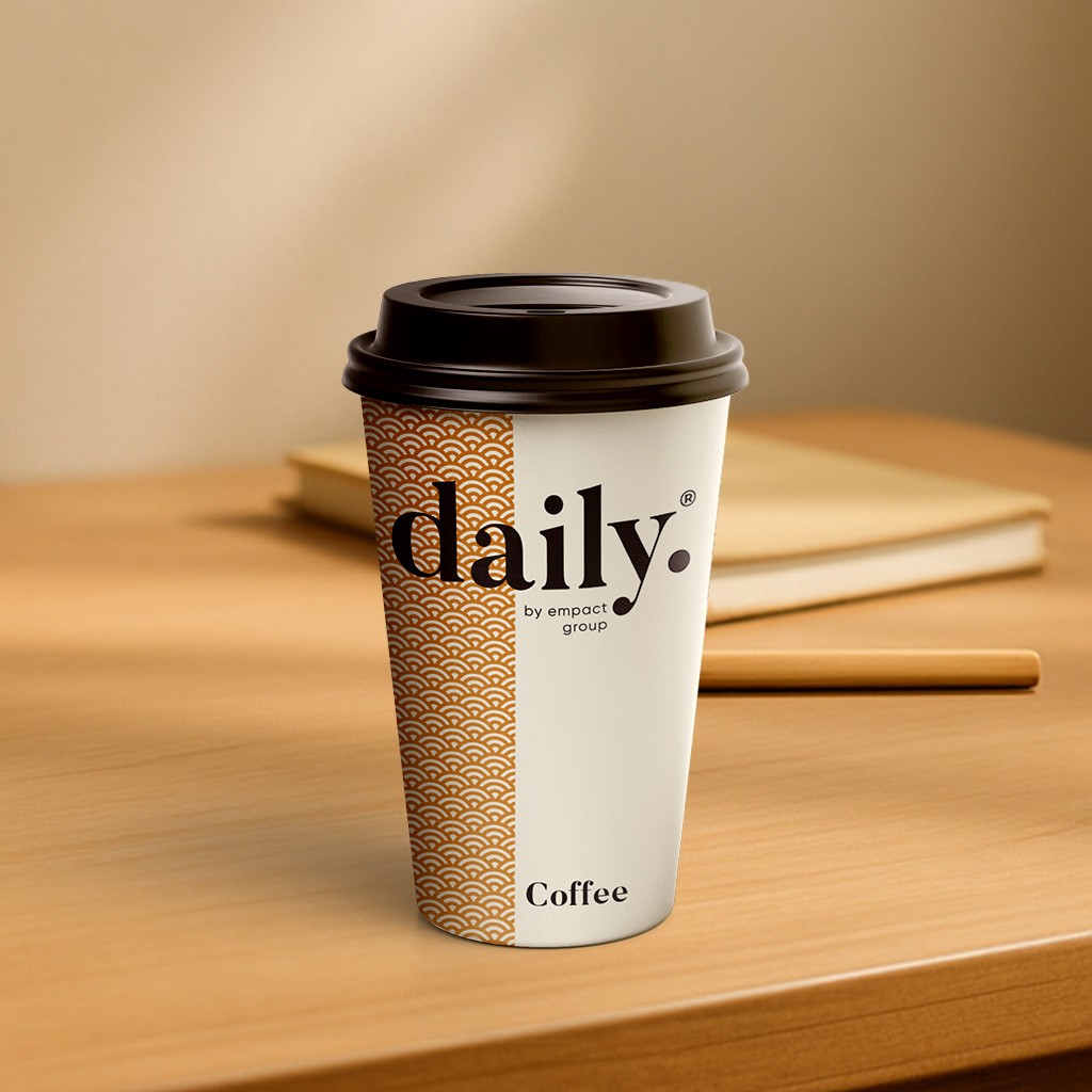
daily product pattern
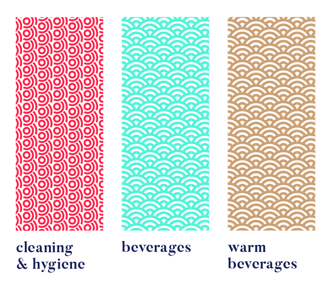
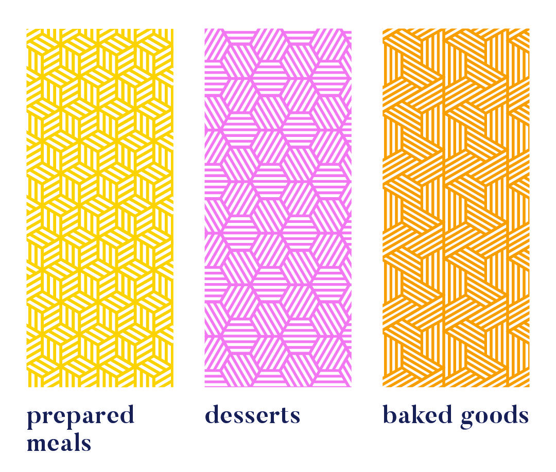
Each range uses a unique pattern for quick visual recognition.
Colour variations within a pattern distinguish sub-products, like hot vs cold drinks or juice flavours. Cleaning & Hygiene products use a red pattern from the Supercare logo, signalling both chemical use and brand affiliation.
daily product creative


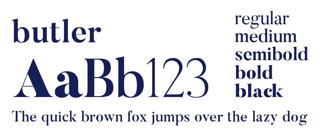
daily typography

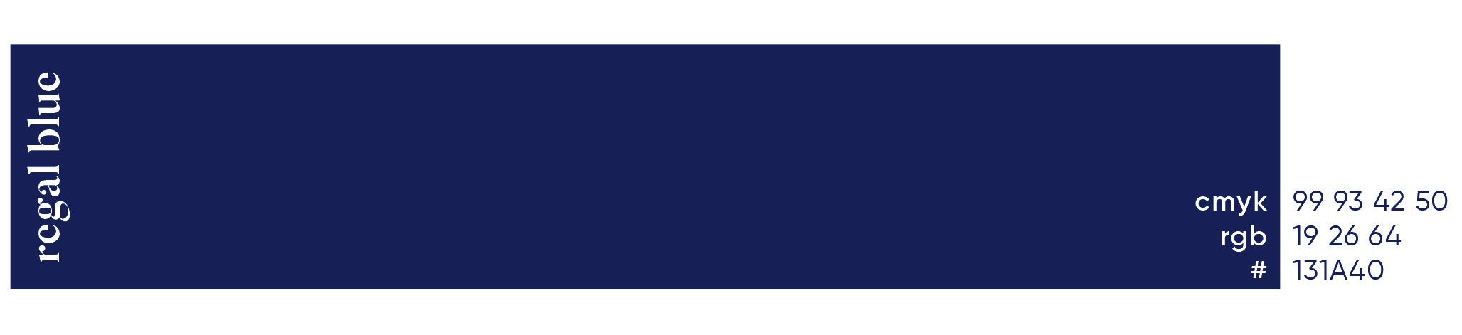
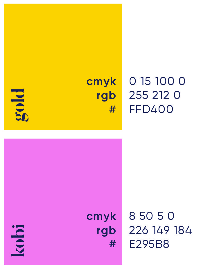
daily primary colour
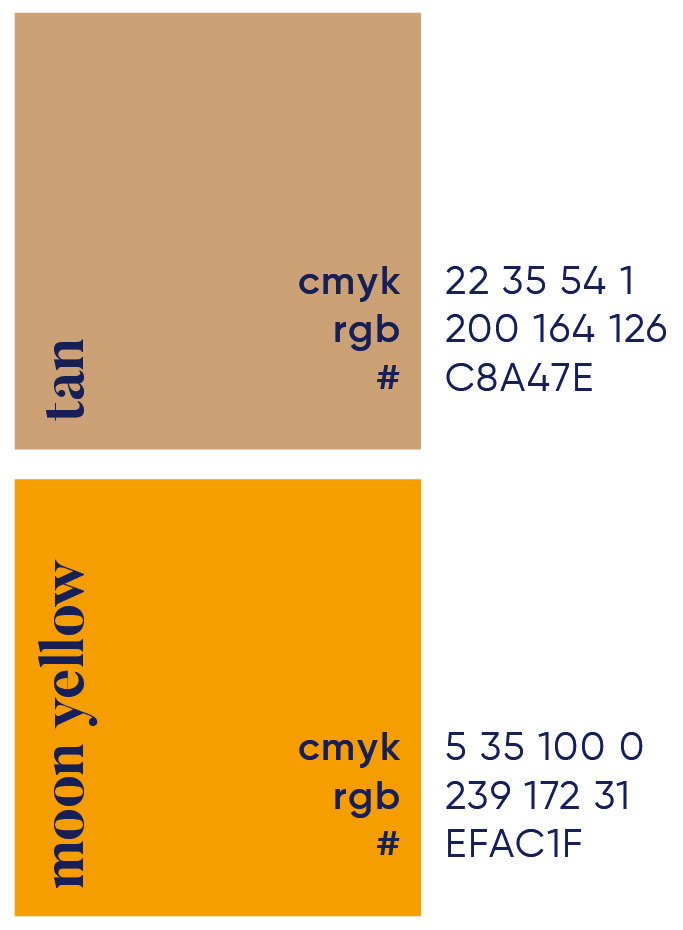
daily secondary colour palette

daily brand pattern


More Works

Qunu Riders
Qunu Riders was born from a love of the long road. An affordable adventure touring company offering guided motorcycle journeys through South Africa and Spain, built for riders chasing freedom, not frills.
Problem
Founded by two brothers with a shared passion for adventure biking, Qunu Riders needed a brand that felt rugged and exciting, but also grounded in a modern African aesthetic. The identity had to stand apart from premium touring competitors, while still promising unforgettable, scenic experiences.
We designed a brand rooted in the spirit of exploration, a celebration of detours, back roads and the slower, scenic way around. The logomark forms a continuous single line spelling “Qunu,” shaped into a rhythmic wave that echoes the curves of distant roads. It’s segmented into three bold colours, each tied to a dominant landscape on the tours: burgundy for rocky mountain passes, yellow for dry desert routes and teal blue for coastal stretches and lakeside detours.
These segments became the foundation of the visual language, repeated as flowing patterns and overlaid on photography to evoke motion and terrain. The result is a flexible, expressive identity that captures the joy of the journey, not just the destination.
Roles
Creative Direction - Shakera Kaloo
Design - Reinhard Greyling
product logo
The identity used a simple, elegant and recognisable wordmark that could work across a wide variety of products and function easily as a conglomerate brand mark.
The pattern would serve to identify the product range and in some instances the pattern colour is used to distinguish mutiple products under the same range, such as flavours of fruit juice.
daily brand structure
The design uses generous white space to fit dense copy on small labels. Scalable branding elements create extra room, with the product name aligned above the holding company byline at the label’s base.
daily product pattern
Each range uses a unique pattern for quick visual recognition.
Colour variations within a pattern distinguish sub-products, like hot vs cold drinks or juice flavours. Cleaning & Hygiene products use a red pattern from the Supercare logo, signalling both chemical use and brand affiliation.
daily product creative
daily typography
daily primary colour
daily secondary colour palette
daily brand pattern
More Works
Qunu Riders
Qunu Riders was born from a love of the long road. An affordable adventure touring company offering guided motorcycle journeys through South Africa and Spain, built for riders chasing freedom, not frills.
Problem
Founded by two brothers with a shared passion for adventure biking, Qunu Riders needed a brand that felt rugged and exciting, but also grounded in a modern African aesthetic. The identity had to stand apart from premium touring competitors, while still promising unforgettable, scenic experiences.
We designed a brand rooted in the spirit of exploration, a celebration of detours, back roads and the slower, scenic way around. The logomark forms a continuous single line spelling “Qunu,” shaped into a rhythmic wave that echoes the curves of distant roads. It’s segmented into three bold colours, each tied to a dominant landscape on the tours: burgundy for rocky mountain passes, yellow for dry desert routes and teal blue for coastal stretches and lakeside detours.
These segments became the foundation of the visual language, repeated as flowing patterns and overlaid on photography to evoke motion and terrain. The result is a flexible, expressive identity that captures the joy of the journey, not just the destination.
Roles
Creative Direction - Shakera Kaloo
Design - Reinhard Greyling
product logo
The identity used a simple, elegant and recognizable wordmark that could work across a wide varfiety of products and function easily as a conglomerate brand mark.
The pattern would serve to identify the product range and in some instances the pattern colour is used to distinguish mutiple products under the same range, such as flavours of fruit juice.
daily brand structure
The design uses generous white space to fit dense copy on small labels.
Scalable branding elements create extra room, with the product name aligned above the holding company byline at the label’s base.
daily product pattern
Each range uses a unique pattern for quick visual recognition.
Colour variations within a pattern distinguish sub-products, like hot vs cold drinks or juice flavours. Cleaning & Hygiene products use a red pattern from the Supercare logo, signalling both chemical use and brand affiliation.
daily product creative
daily typography
daily primary colour

daily secondary colour
palette
daily brand pattern
More Works