

Stratosphere
Strat0sphere was built to launch business relationships into new territory. A sleek, tech-forward networking platform designed to help companies partner, grow and reach greater heights together.
Problem
Atio approached us to brand their new B2B social platform. A digital space for companies to connect and collaborate. The identity needed to convey a sense of innovation and ambition while remaining grounded in corporate credibility.
We developed a clean, modular identity inspired by the platform’s binary foundations, a system built around connection, clarity and digital fluency. The logotype features a custom “0” that nods to binary code, representing the one-to-one partnerships the platform was built to foster. A bold palette of deep navy and solar yellow conveys trust, energy and momentum, while curved forms suggest altitude and lift.
To support real-world application, we designed a system of adaptable brand elements including dynamic patterns and scalable supergraphics. These assets bring a sense of depth and movement across digital and physical environments, from app interfaces and ID cards to large-scale signage and printed collateral. This flexibility ensures the brand remains cohesive yet expressive, capable of growing with the platform as it expands its possibilities.
Roles
Creative Direction - Shakera Kaloo
Design - Reinhard Greyling

product logo

The identity used a simple, elegant and recognisable wordmark that could work across a wide variety of products and function easily as a conglomerate brand mark.
The pattern would serve to identify the product range and in some instances the pattern colour is used to distinguish mutiple products under the same range, such as flavours of fruit juice.
daily brand structure
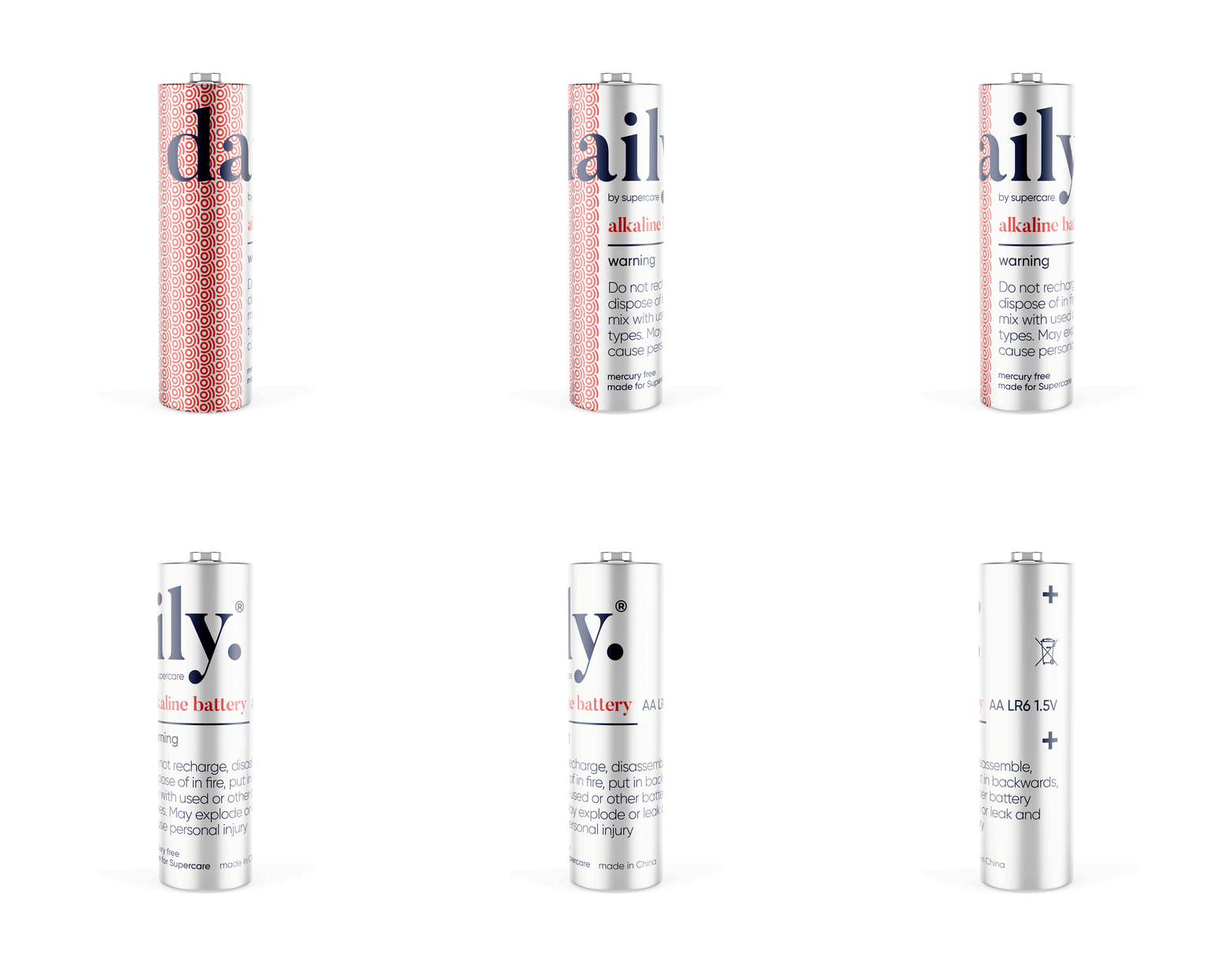
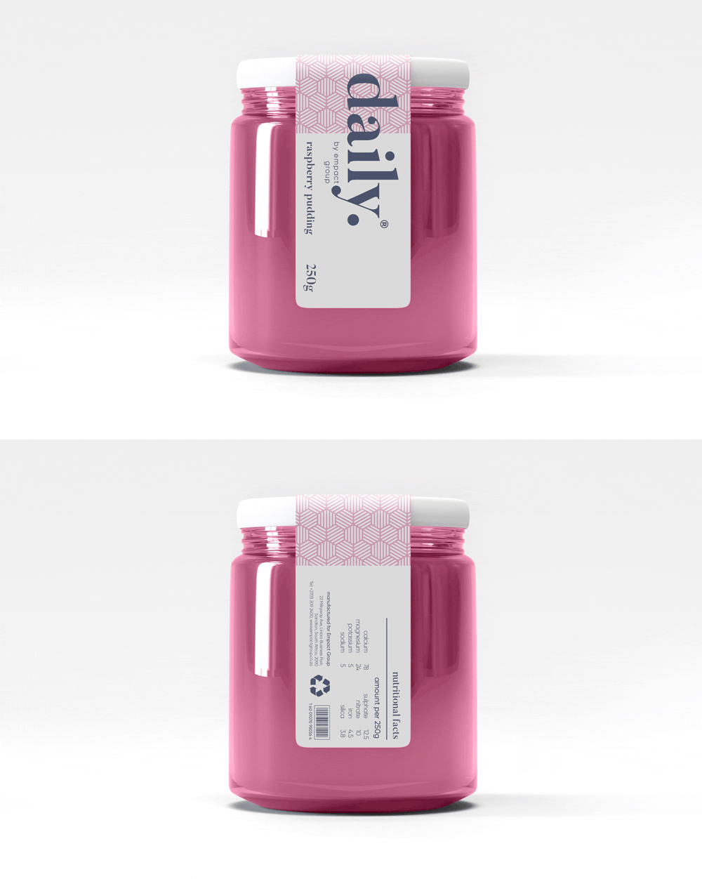
The design uses generous white space to fit dense copy on small labels.
Scalable branding elements create extra room, with the product name aligned above the holding company byline at the label’s base.

daily product pattern
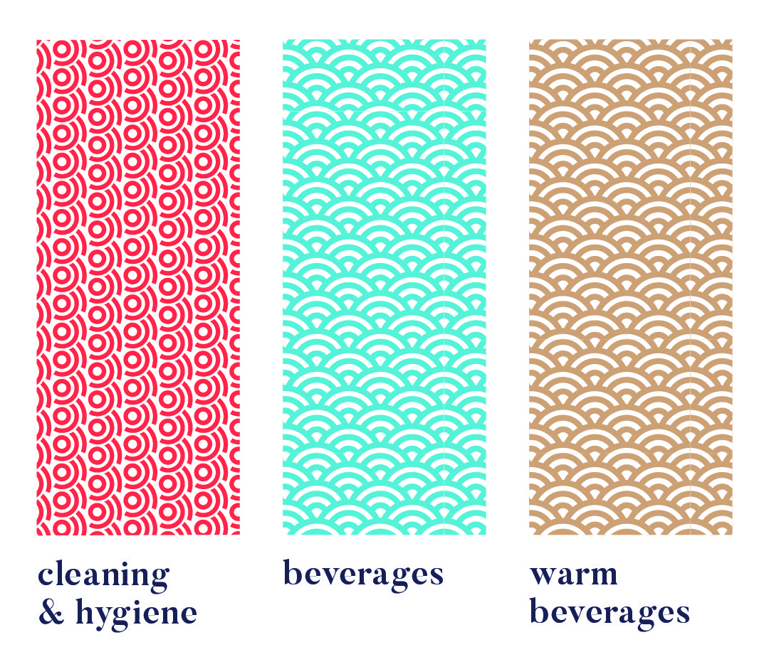
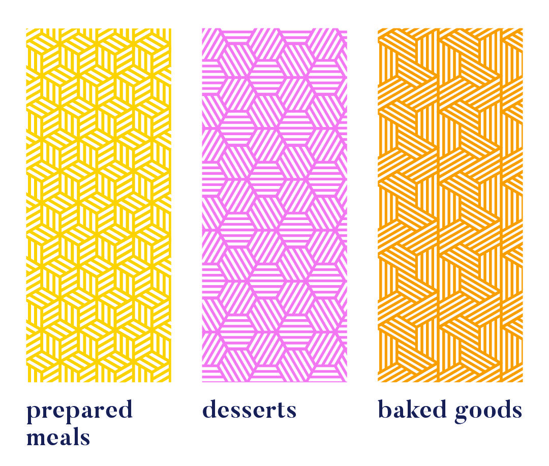
Each range uses a unique pattern for quick visual recognition.
Colour variations within a pattern distinguish sub-products, like hot vs cold drinks or juice flavours. Cleaning & Hygiene products use a red pattern from the Supercare logo, signalling both chemical use and brand affiliation.
daily product creative




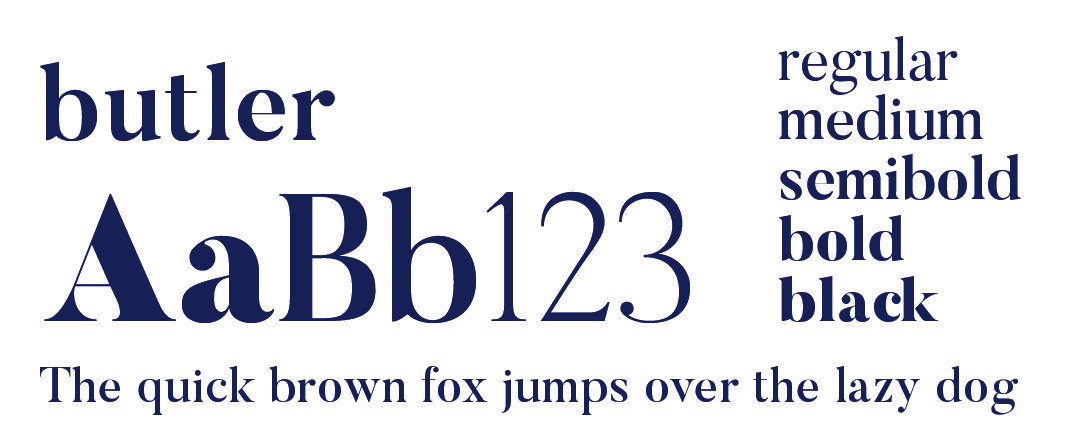
daily typography

daily primary colour

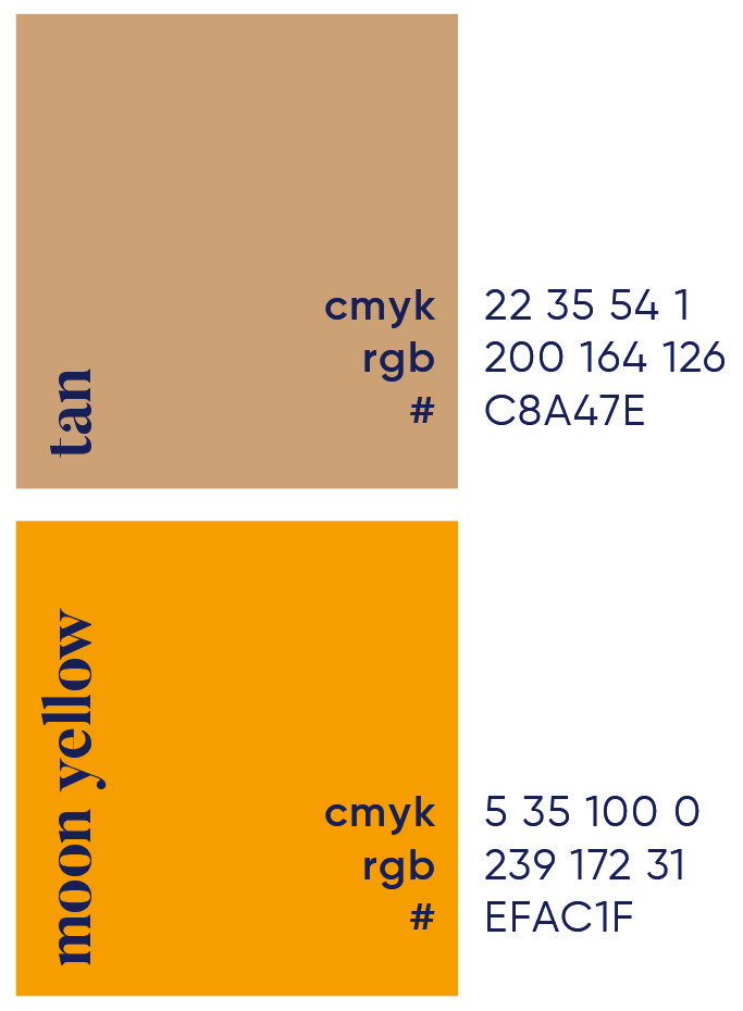
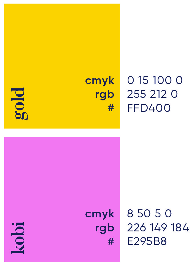
daily secondary colour palette

daily brand pattern


More Works


Stratosphere
Strat0sphere was built to launch business relationships into new territory. A sleek, tech-forward networking platform designed to help companies partner, grow and reach greater heights together.
Problem
Atio approached us to brand their new B2B social platform. A digital space for companies to connect and collaborate. The identity needed to convey a sense of innovation and ambition while remaining grounded in corporate credibility.
We developed a clean, modular identity inspired by the platform’s binary foundations, a system built around connection, clarity and digital fluency. The logotype features a custom “0” that nods to binary code, representing the one-to-one partnerships the platform was built to foster. A bold palette of deep navy and solar yellow conveys trust, energy and momentum, while curved forms suggest altitude and lift.
To support real-world application, we designed a system of adaptable brand elements including dynamic patterns and scalable supergraphics. These assets bring a sense of depth and movement across digital and physical environments, from app interfaces and ID cards to large-scale signage and printed collateral. This flexibility ensures the brand remains cohesive yet expressive, capable of growing with the platform as it expands its possibilities.
Roles
Creative Direction - Shakera Kaloo
Design - Reinhard Greyling

product logo

The identity used a simple, elegant and recognisable wordmark that could work across a wide variety of products and function easily as a conglomerate brand mark.
The pattern would serve to identify the product range and in some instances the pattern colour is used to distinguish mutiple products under the same range, such as flavours of fruit juice.
daily brand structure
The design uses generous white space to fit dense copy on small labels. Scalable branding elements create extra room, with the product name aligned above the holding company byline at the label’s base.

daily product pattern


Each range uses a unique pattern for quick visual recognition.
Colour variations within a pattern distinguish sub-products, like hot vs cold drinks or juice flavours. Cleaning & Hygiene products use a red pattern from the Supercare logo, signalling both chemical use and brand affiliation.
daily product creative


daily typography


daily primary colour

daily secondary colour palette


daily brand pattern


More Works


Stratosphere
Strat0sphere was built to launch business relationships into new territory. A sleek, tech-forward networking platform designed to help companies partner, grow and reach greater heights together.
Problem
Atio approached us to brand their new B2B social platform. A digital space for companies to connect and collaborate. The identity needed to convey a sense of innovation and ambition while remaining grounded in corporate credibility.
We developed a clean, modular identity inspired by the platform’s binary foundations, a system built around connection, clarity and digital fluency. The logotype features a custom “0” that nods to binary code, representing the one-to-one partnerships the platform was built to foster. A bold palette of deep navy and solar yellow conveys trust, energy and momentum, while curved forms suggest altitude and lift.
To support real-world application, we designed a system of adaptable brand elements including dynamic patterns and scalable supergraphics. These assets bring a sense of depth and movement across digital and physical environments, from app interfaces and ID cards to large-scale signage and printed collateral. This flexibility ensures the brand remains cohesive yet expressive, capable of growing with the platform as it expands its possibilities.
Roles
Creative Direction - Shakera Kaloo
Design - Reinhard Greyling

product logo

The identity used a simple, elegant and recognizable wordmark that could work across a wide varfiety of products and function easily as a conglomerate brand mark.
The pattern would serve to identify the product range and in some instances the pattern colour is used to distinguish mutiple products under the same range, such as flavours of fruit juice.
daily brand structure
The design uses generous white space to fit dense copy on small labels.
Scalable branding elements create extra room, with the product name aligned above the holding company byline at the label’s base.

daily product pattern


Each range uses a unique pattern for quick visual recognition.
Colour variations within a pattern distinguish sub-products, like hot vs cold drinks or juice flavours. Cleaning & Hygiene products use a red pattern from the Supercare logo, signalling both chemical use and brand affiliation.
daily product creative


daily typography


daily primary colour

daily secondary colour
palette


daily brand pattern


More Works