
Daily
Daily was created by Empact Group to deliver bold, bespoke products to their on-site cafés. A brand designed to feel fresh, familiar and something clients would look forward to every day.
The Problem
Empact Group approached us to design an identity for their new house brand of perishable food products, sold through their outsourced cafeteria service.
The goal was to deliver high-quality products directly to clients without relying on additional suppliers. The identity needed to be robust and flexible, able to cover a wide range of products, with room to grow.
Midway through development, the product range expanded rapidly, extending beyond perishables into categories like household and hygiene goods under the Supercare brand. This shift meant the original identity, focused solely on food, was no longer viable.
The solution: a clean, bold system built around a strong typographic logo, versatile patterns, and generous negative space. Adaptable enough to house a growing and diverse product lineup.
Roles
Creative Direction - Shakera Kaloo
Design - Reinhard Greyling
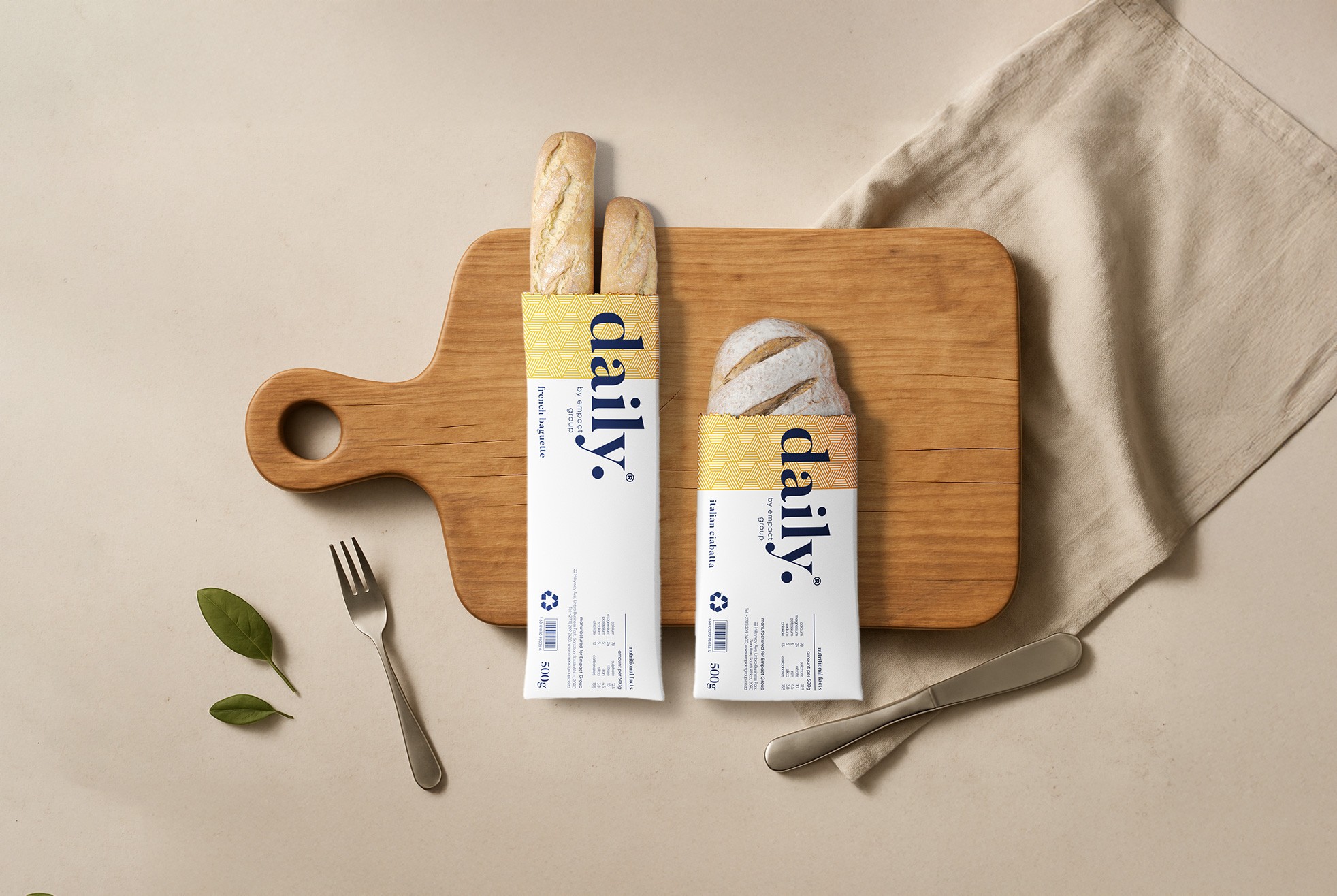
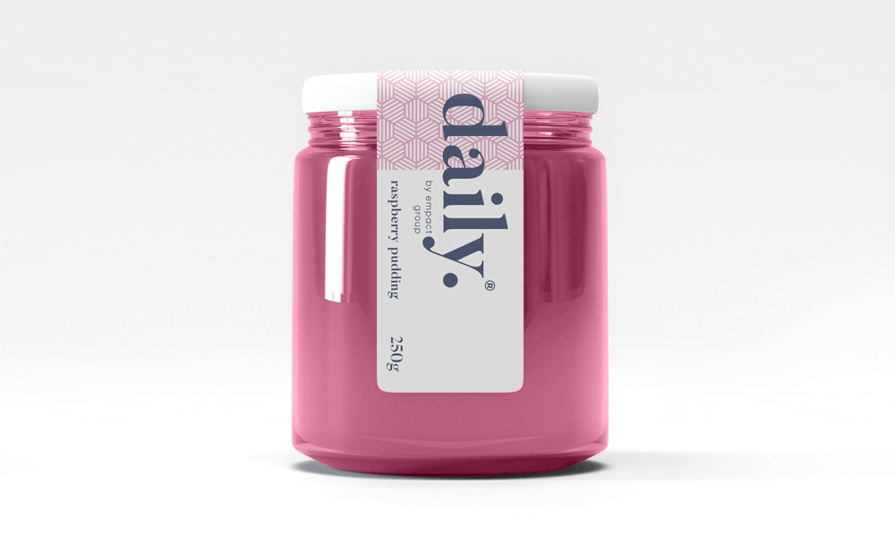
product logo

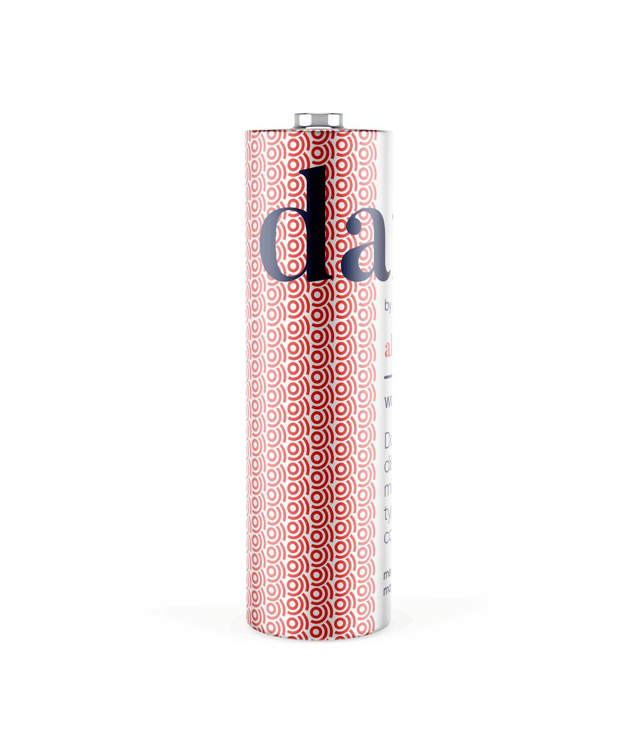
The identity used a simple, elegant and recognisable wordmark that could work across a wide variety of products and function easily as a conglomerate brand mark.
The pattern would serve to identify the product range and in some instances the pattern colour is used to distinguish mutiple products under the same range, such as flavours of fruit juice.
daily brand structure
The design uses generous white space to fit dense copy on small labels.
Scalable branding elements create extra room, with the product name aligned above the holding company byline at the label’s base.

daily product pattern
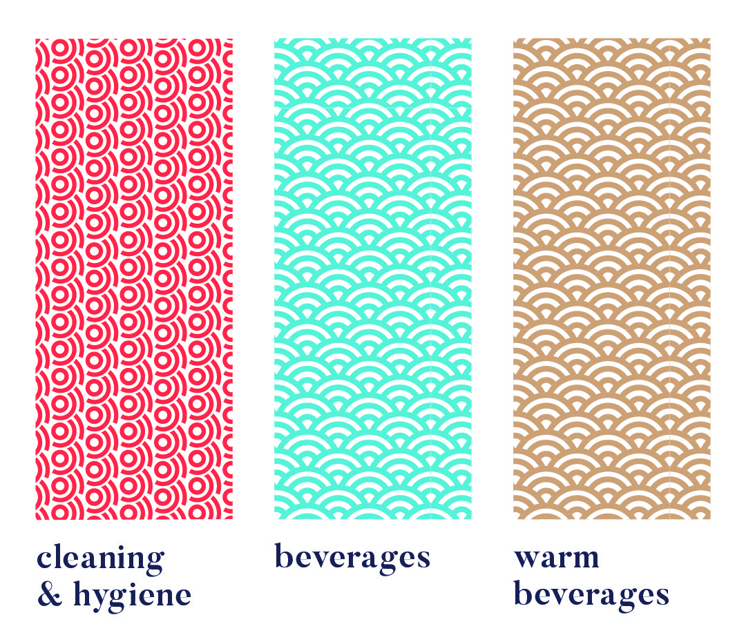
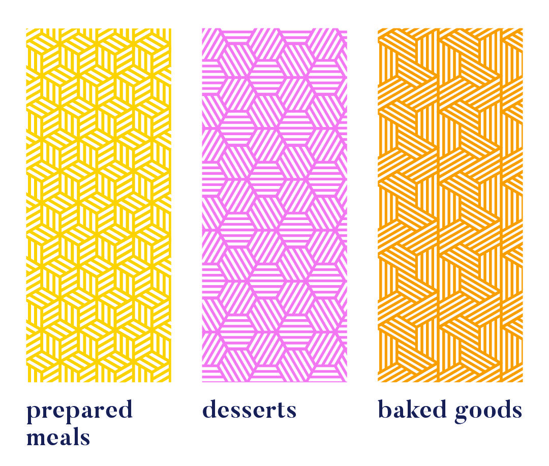
Each range uses a unique pattern for quick visual recognition.
Colour variations within a pattern distinguish sub-products, like hot vs cold drinks or juice flavours. Cleaning & Hygiene products use a red pattern from the Supercare logo, signalling both chemical use and brand affiliation.
daily product creative


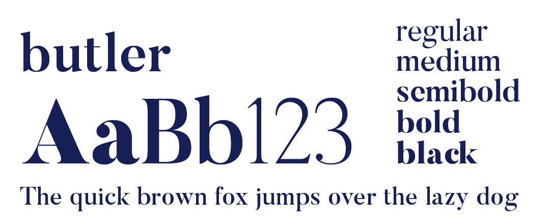
daily typography

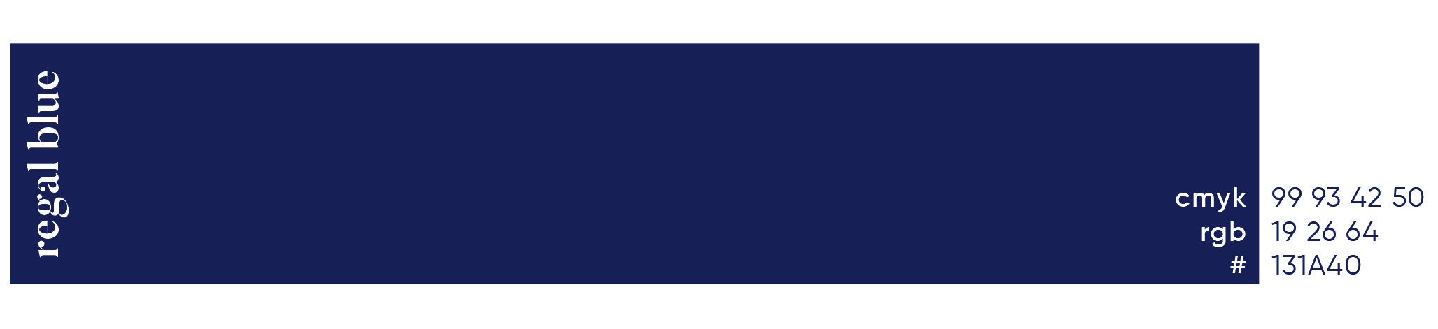
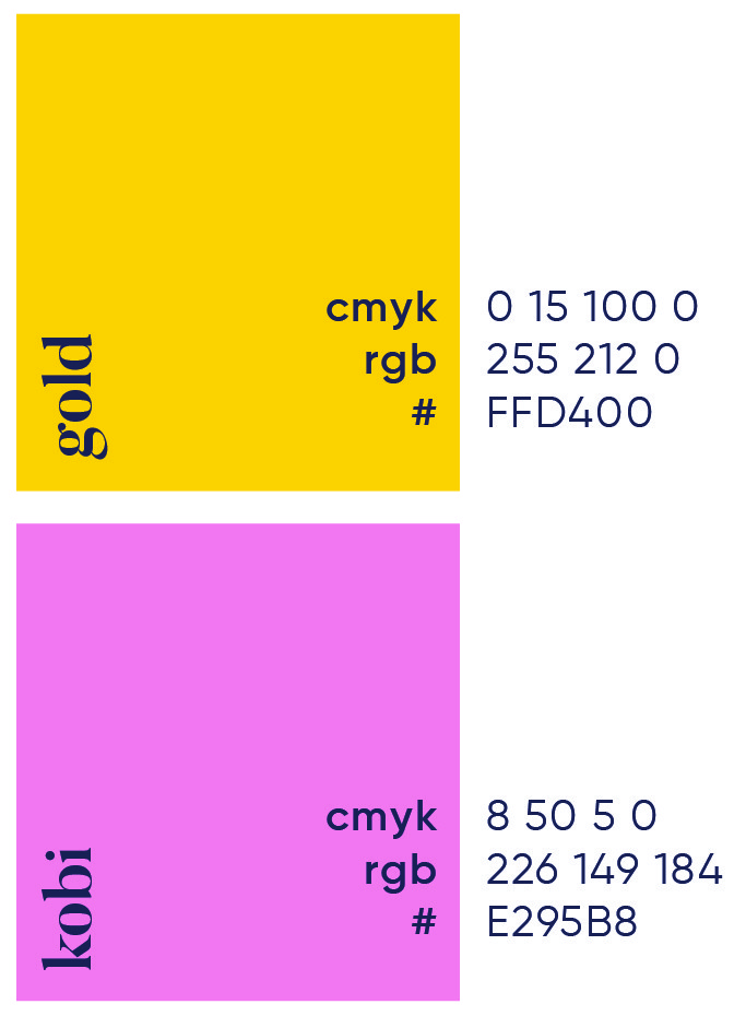
daily primary colour
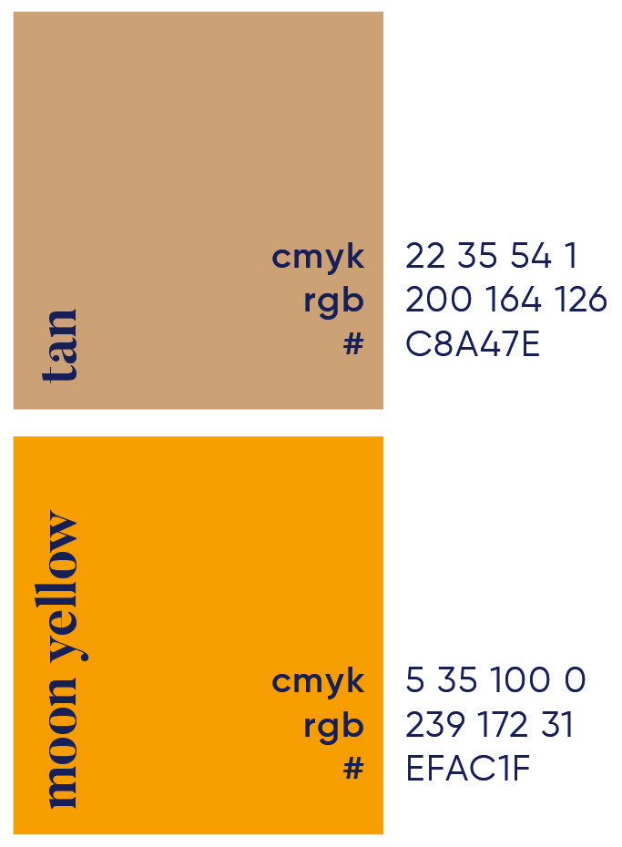
daily secondary colour palette

daily brand pattern


More Works

Daily
Daily was created by Empact Group to deliver bold, bespoke products to their on-site cafés. A brand designed to feel fresh, familiar and something clients would look forward to every day.
The Problem
Empact Group approached us to design an identity for their new house brand of perishable food products, sold through their outsourced cafeteria service.
The goal was to deliver high-quality products directly to clients without relying on additional suppliers. The identity needed to be robust and flexible, able to cover a wide range of products, with room to grow.
Midway through development, the product range expanded rapidly, extending beyond perishables into categories like household and hygiene goods under the Supercare brand. This shift meant the original identity, focused solely on food, was no longer viable.
The solution: a clean, bold system built around a strong typographic logo, versatile patterns, and generous negative space. Adaptable enough to house a growing and diverse product lineup.
Roles
Creative Direction - Shakera Kaloo
Design - Reinhard Greyling
product logo
The identity used a simple, elegant and recognisable wordmark that could work across a wide variety of products and function easily as a conglomerate brand mark.
The pattern would serve to identify the product range and in some instances the pattern colour is used to distinguish mutiple products under the same range, such as flavours of fruit juice.
daily brand structure
The design uses generous white space to fit dense copy on small labels. Scalable branding elements create extra room, with the product name aligned above the holding company byline at the label’s base.
daily product pattern
Each range uses a unique pattern for quick visual recognition.
Colour variations within a pattern distinguish sub-products, like hot vs cold drinks or juice flavours. Cleaning & Hygiene products use a red pattern from the Supercare logo, signalling both chemical use and brand affiliation.
daily product creative
daily typography
daily primary colour
daily secondary colour palette
daily brand pattern
More Works
Daily
Daily was created by Empact Group to deliver bold, bespoke products to their on-site cafés. A brand designed to feel fresh, familiar and something clients would look forward to every day.
The Problem
Empact Group approached us to design an identity for their new house brand of perishable food products, sold through their outsourced cafeteria service.
The goal was to deliver high-quality products directly to clients without relying on additional suppliers. The identity needed to be robust and flexible, able to cover a wide range of products, with room to grow.
Midway through development, the product range expanded rapidly, extending beyond perishables into categories like household and hygiene goods under the Supercare brand. This shift meant the original identity, focused solely on food, was no longer viable.
The solution: a clean, bold system built around a strong typographic logo, versatile patterns, and generous negative space. Adaptable enough to house a growing and diverse product lineup.
Roles
Creative Direction - Shakera Kaloo
Design - Reinhard Greyling
product logo
The identity used a simple, elegant and recognizable wordmark that could work across a wide varfiety of products and function easily as a conglomerate brand mark.
The pattern would serve to identify the product range and in some instances the pattern colour is used to distinguish mutiple products under the same range, such as flavours of fruit juice.
daily brand structure
The design uses generous white space to fit dense copy on small labels.
Scalable branding elements create extra room, with the product name aligned above the holding company byline at the label’s base.
daily product pattern
Each range uses a unique pattern for quick visual recognition.
Colour variations within a pattern distinguish sub-products, like hot vs cold drinks or juice flavours. Cleaning & Hygiene products use a red pattern from the Supercare logo, signalling both chemical use and brand affiliation.
daily product creative
daily typography
daily primary colour

daily secondary colour
palette
daily brand pattern
More Works